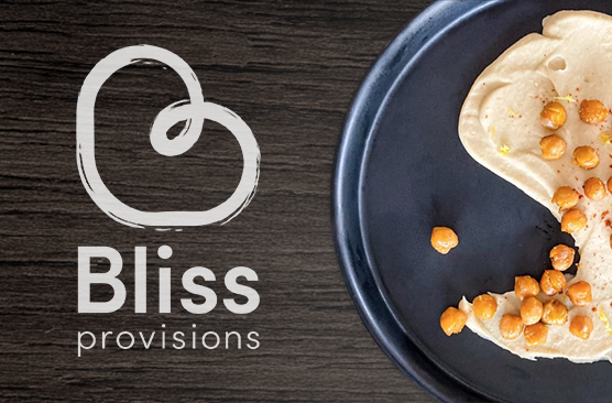
Bliss Provisions
Bliss Provisions is a new food brand out of Tokyo, Japan. They specialize in items like hummus and guacamole that are not easily found in Japan. I worked closely with the owner of Bliss to create a logo that captures the spirit of the brand and balances both professionalism and lightheartedness.
Overview
- Logo Design
- Branding
Tools Used
- Pen and Paper
- FaceTime
- Adobe Illustrator
- Adobe InDesign
- Adobe After Effects
Concepts & Ideas
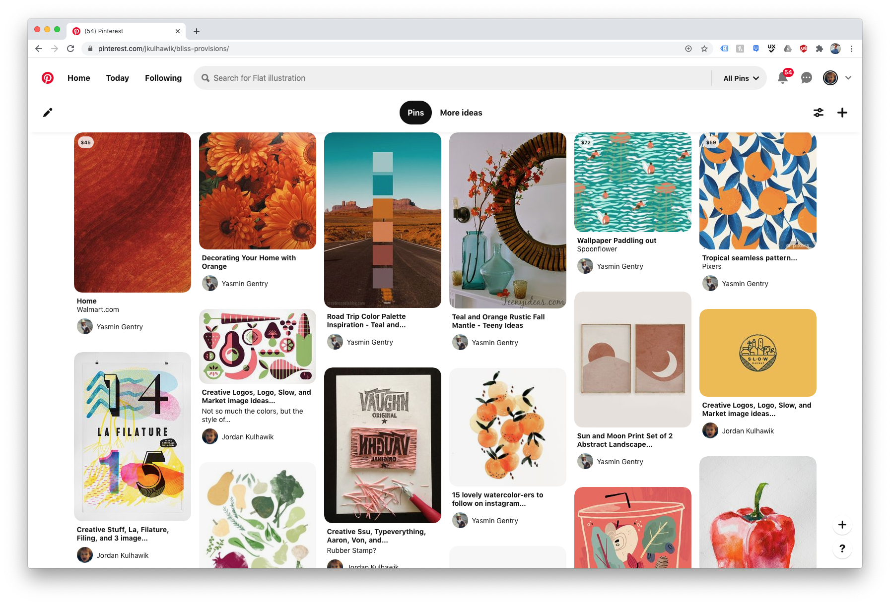
To help understand the direction and concept for the logo, we shared a Pinterest board and had discussions to filter out pins that didn't fit the scheme. From here, I was able to get a basic understanding of the look and feel, and get started on sketching out concepts.
Sketches
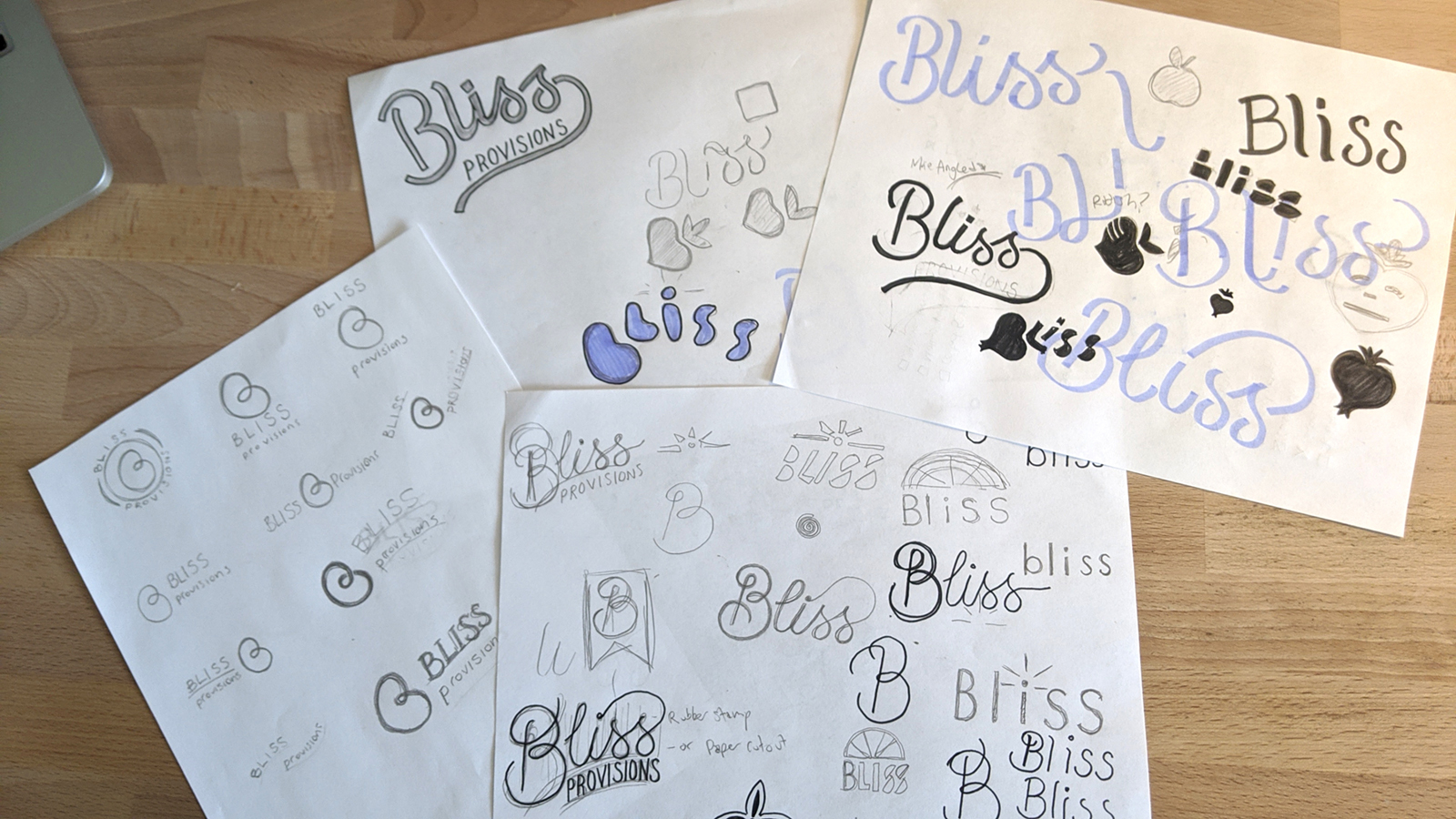
To get as many ideas from my head onto something more permanent as quickly as possible, I sketched out between 40 and 50 different logo ideas. Some were better than others, and some didn't fit the look and feel we were going for. The best ones were created digitally in the next step of the process.
First Round: Rough Drafts
The first round of logos designed in Illustrator were based on the better sketches from the first step in the process. They are rough drafts to get the ideas across and to discuss during our video calls. They would be cleaned up later if chosen. The concept we decided to pursue was the looping B. I explored different ways of expressing this in the next step.
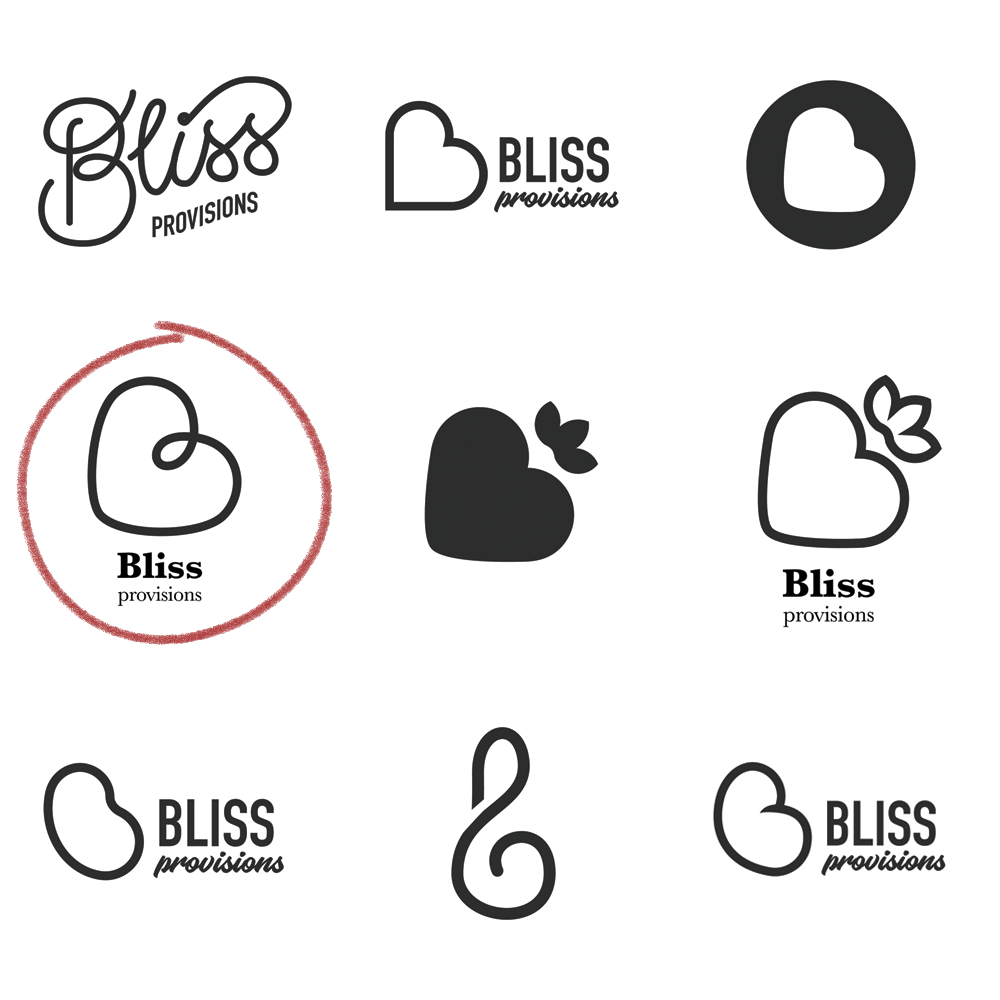
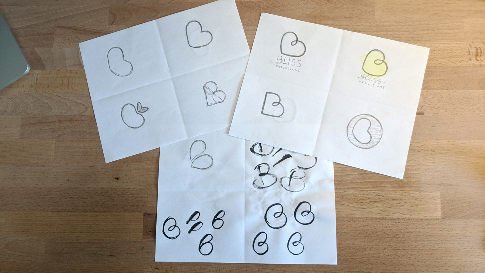
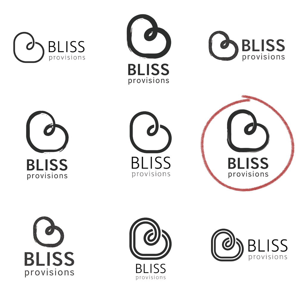
Second Round: Refining Logo Choices
The second round of logos were based on the looping B concept. It connotes both a heart for bliss, and a garbanzo bean, the main ingredient in hummus. I was able to create an image that retained both of these concepts while still looking like an uppercase B.
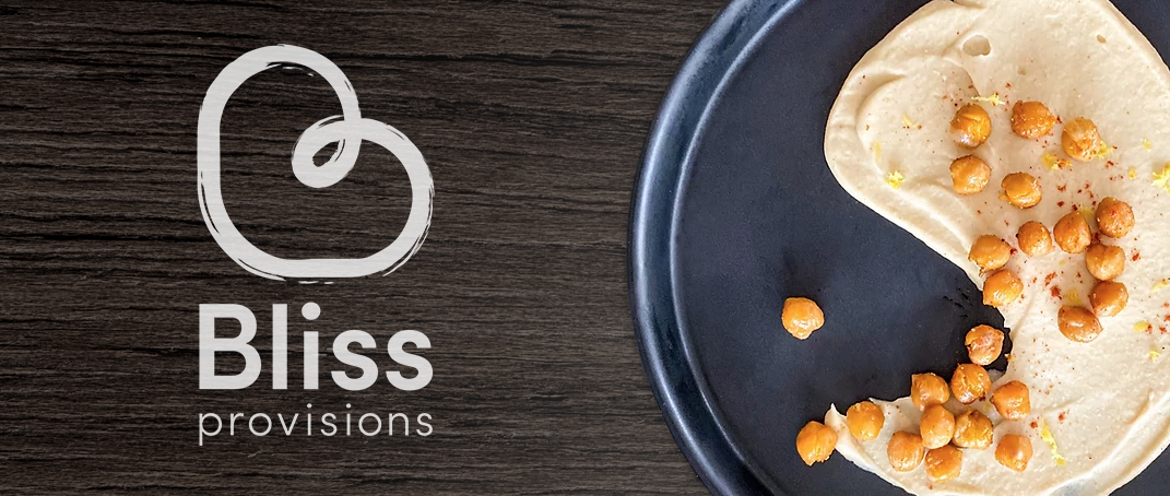
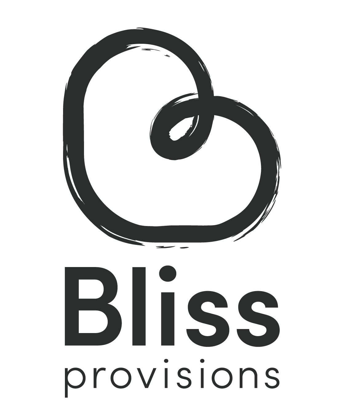
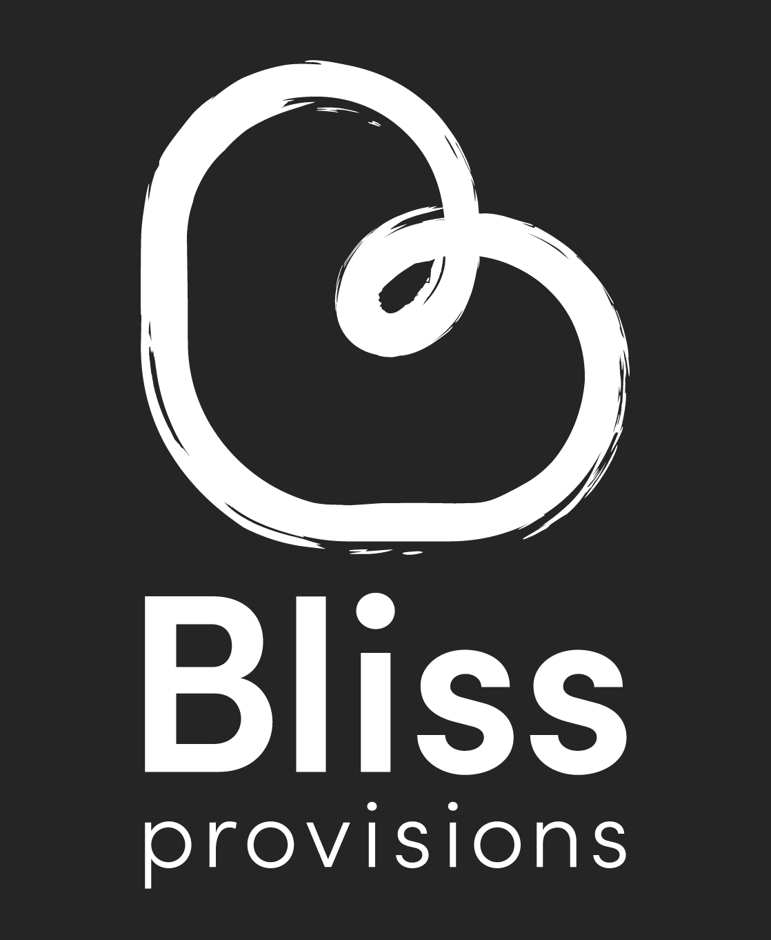
Final Logo
Below are the final versions of the logo. One for dark backgrounds, the other for light backgrounds. The brush strokes have been cleaned up to look more organic, the corner on the B has been rounded out to give it more of a bean appearance, and the final typeface was chosen and aligned properly.
Animation
As a little bonus, I created an animation for the logo using After Effects. I created a vector mask rather than using a stroke to give it a more organic look and to allow it to be exported as a lottie animation.

Selected Works
MalakyeUI Design
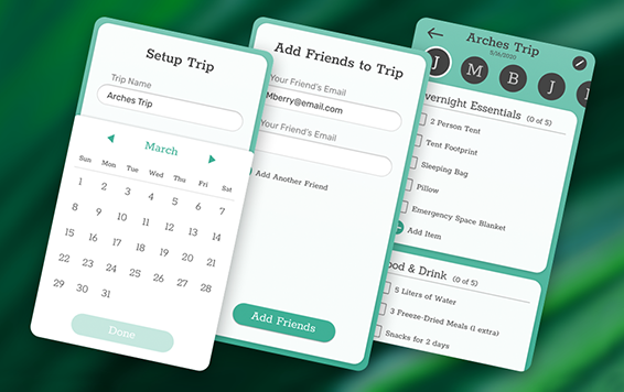
BackpackerUX Design
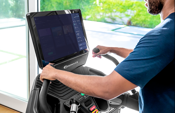
JRNY Headphone ConnectUX Design
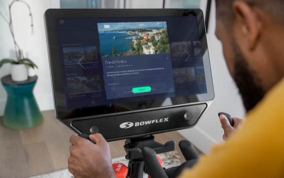
JRNY App Workout ModalsUX Design
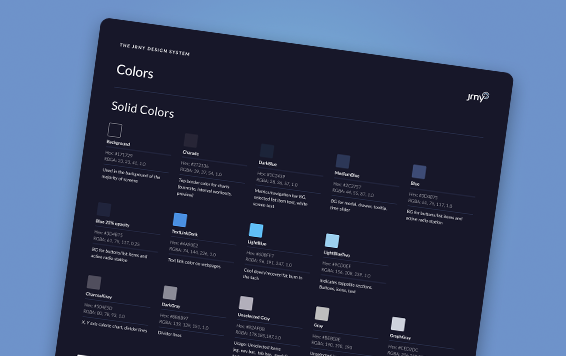
JRNY Color RefinementUX Design
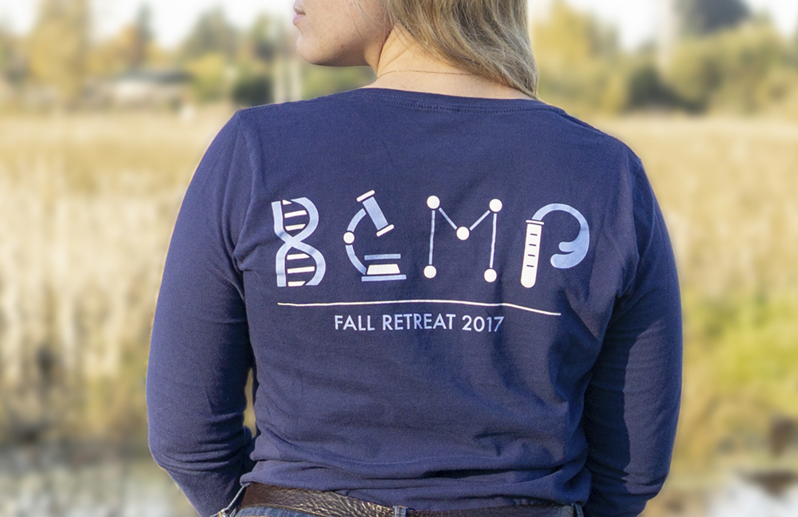
Harvard BCMP ShirtGraphic Design
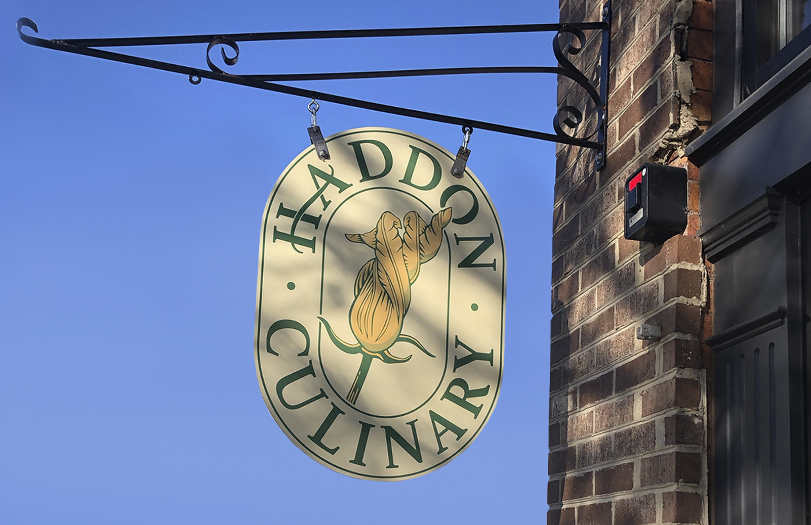
Haddon CulinaryGraphic Design
Bliss ProvisionsGraphic Design
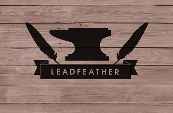
LeadfeatherGraphic Design
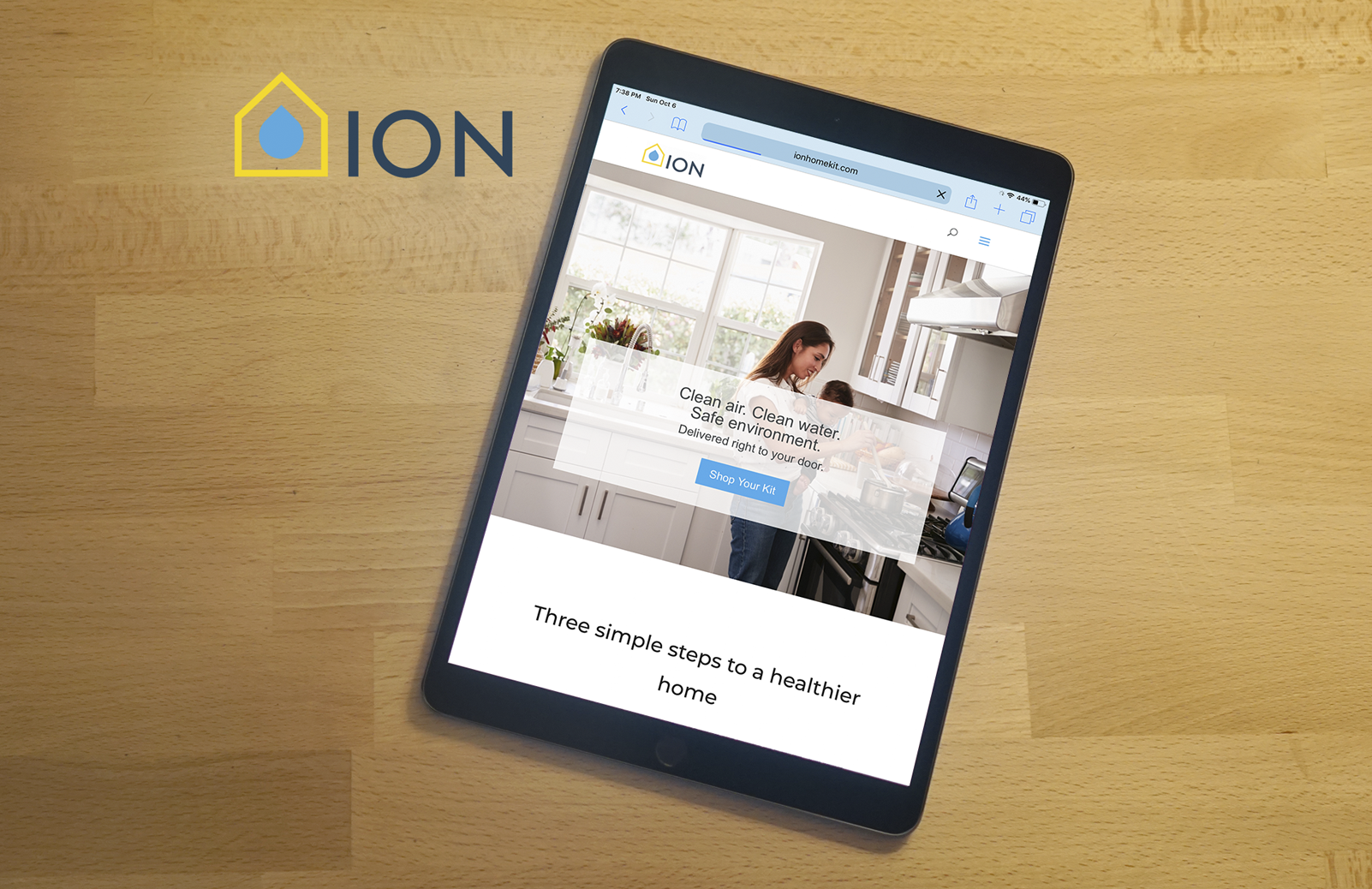
Ion Home KitGraphic Design
Transparent PathProject type
jkulhawik@gmail.com