
Harvard BCMP Shirt
This was a shirt for Harvard Medical School's Biochemistry and Molecular Pharmacology lab's fall retreat. The goal was to represent what the lab does while keeping it fun. Each letter represents a different facet of the lab, with biology, observation, chemistry, and testing being represented.
Overview
- Illustration
- Typography
- T Shirt Design
Tools Used
- Adobe Illustrator
- Adobe Photoshop
- Pen & Paper
Ideation
Sketching is always the first step in my creative process. Here, I was able to get my ideas onto paper without spending too much time on them. Later, I can review them and figure out which ones work and which don't.
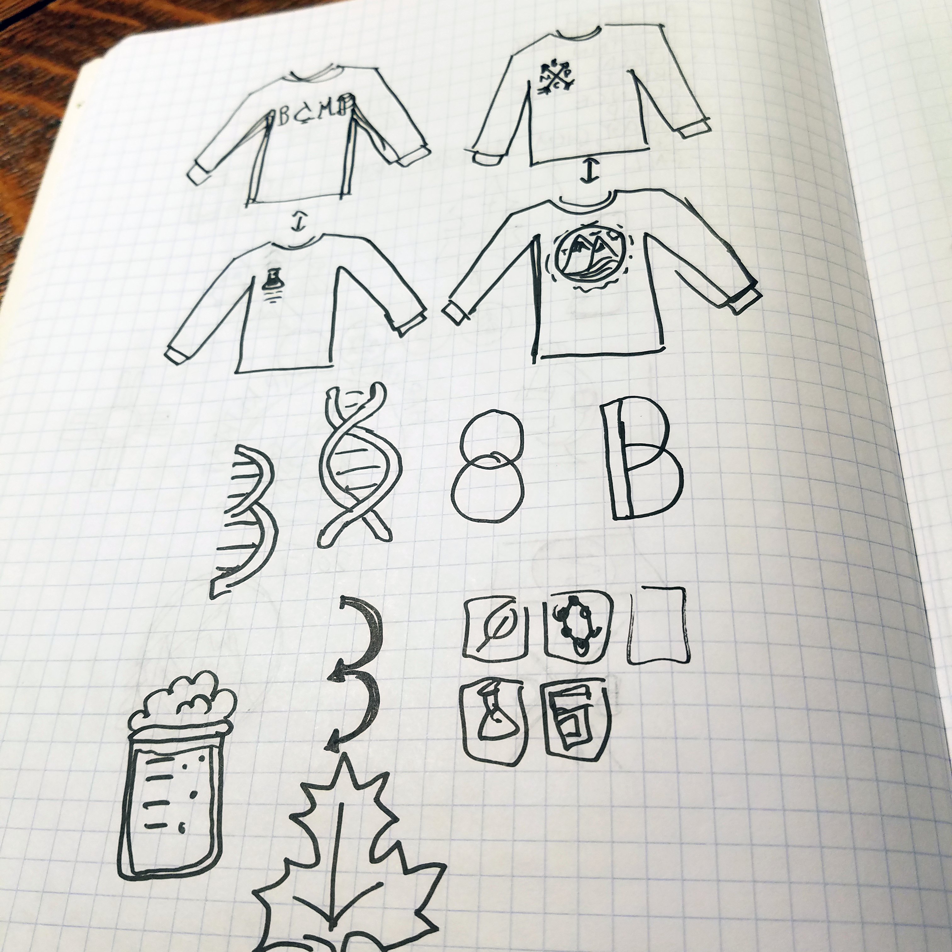
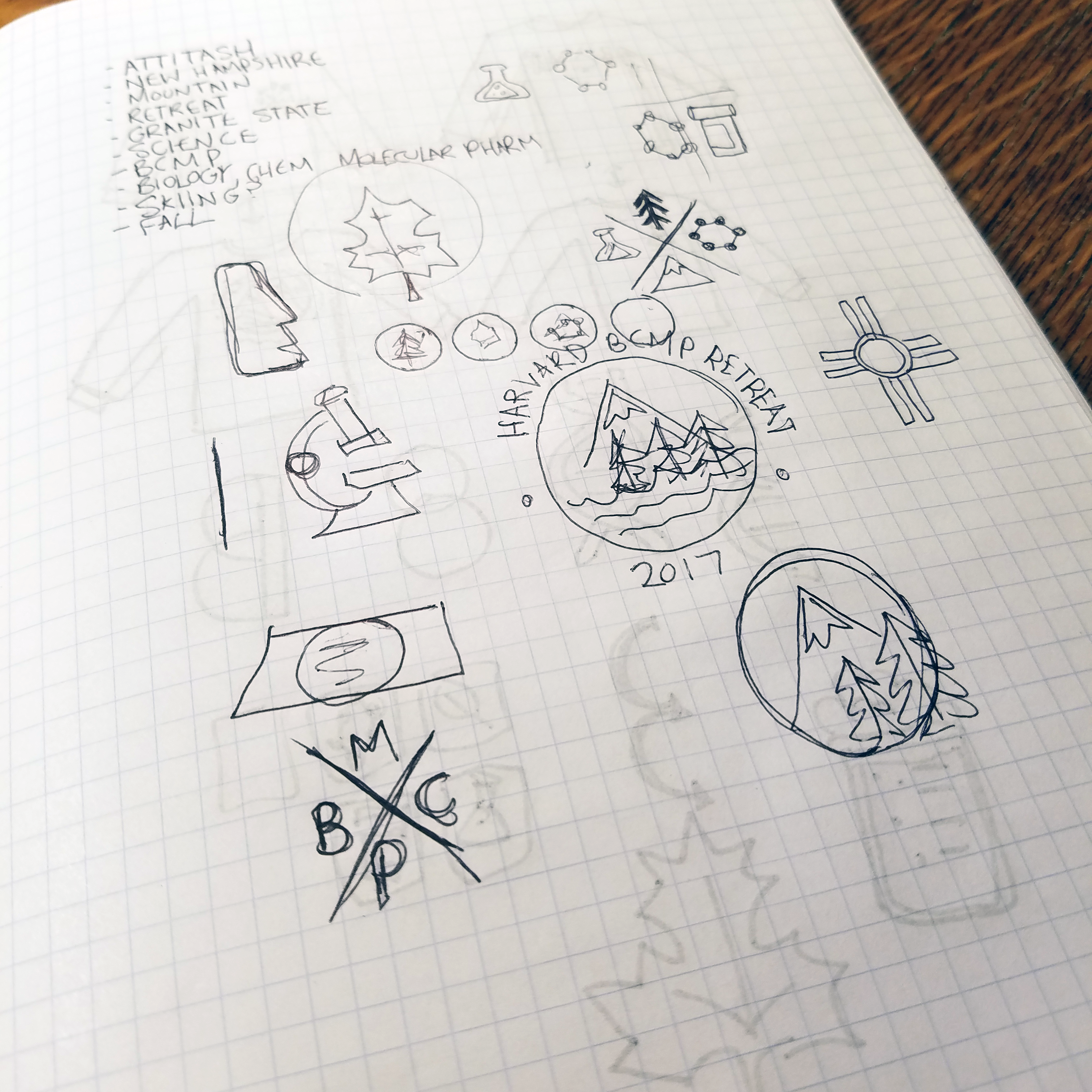
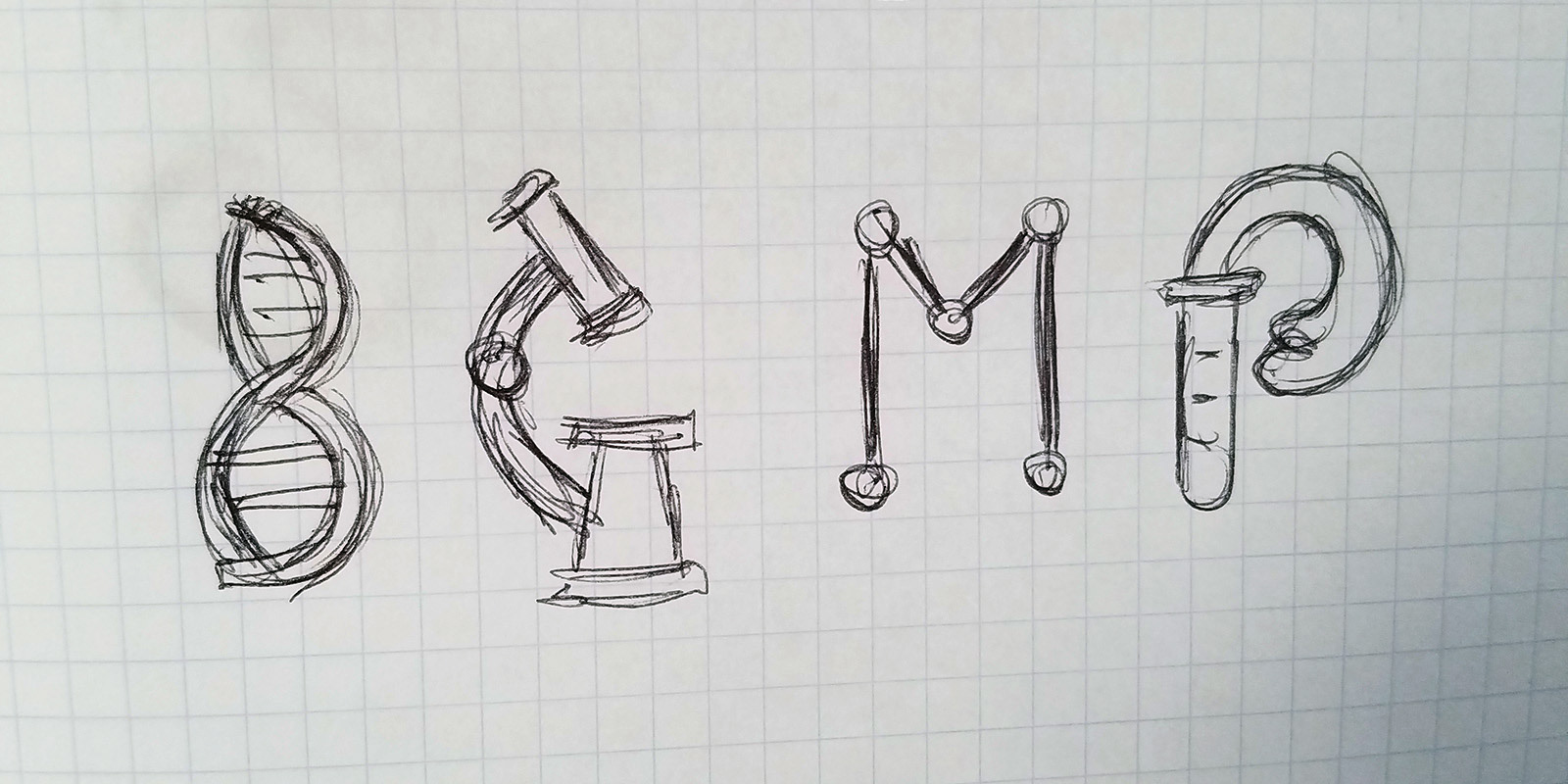
Refining the Ideas
I picked some of the most effective designs to produce in Illustrator. I was able to send these to the BCMP Committee and talk over their thoughts on them. The lower left was the overall top choice, so I refined it further and added color.
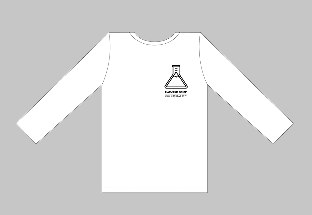

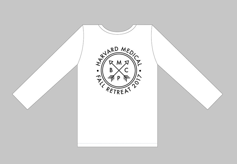
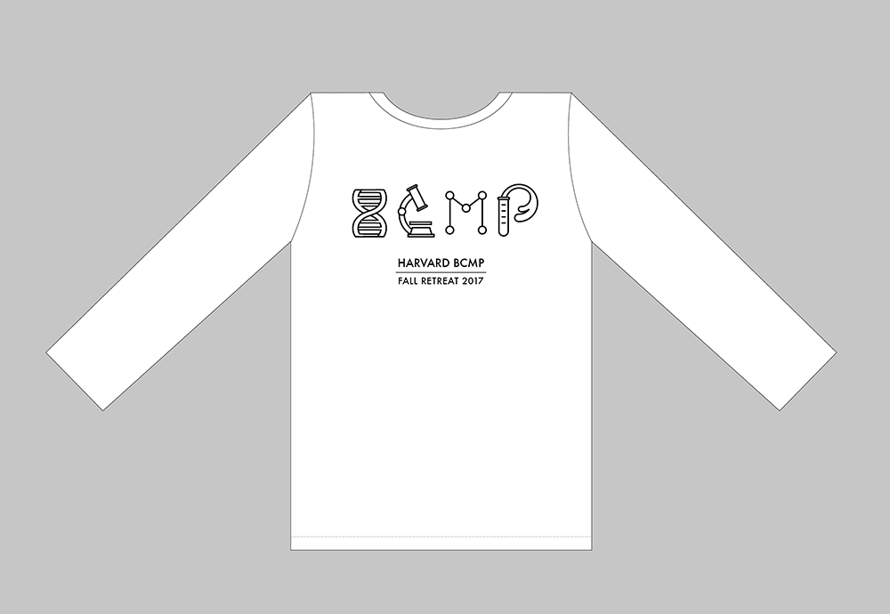
The Winning Graphic
Below is what the BCMP Committee chose as the final graphic. The colors were chosen to stand out on a navy shirt, while being gender neutral and professional. The biggest change from the first version was the most diffficult; making the double helix actually look like the letter B.

Final Product
Since the shirt was being screen printed, the colors had to be separated onto their own individual layers and details specified with the printer. The BCMP lab was very happy with the result, with many members commenting that this was their favorite shirt yet.
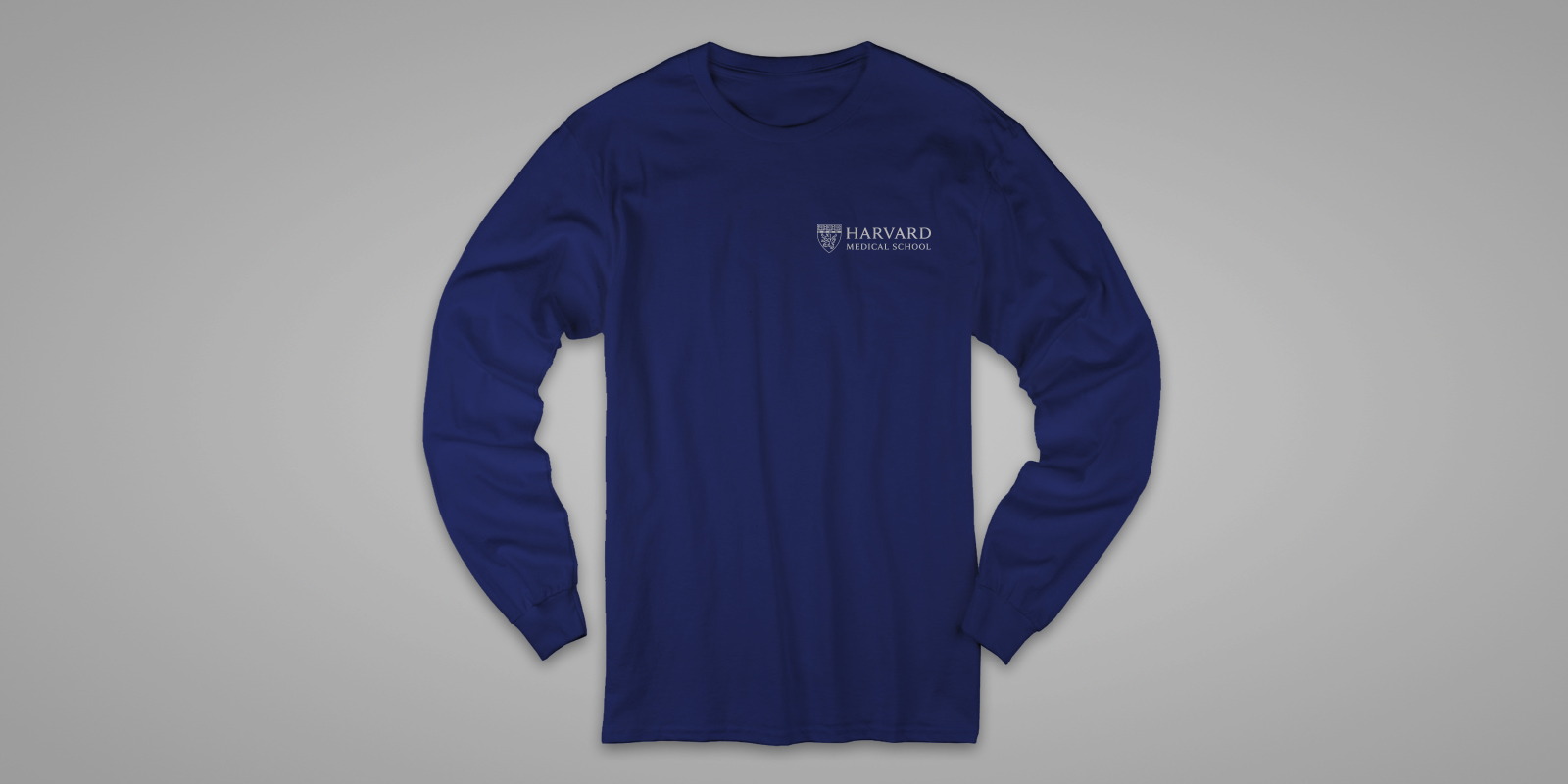
Front
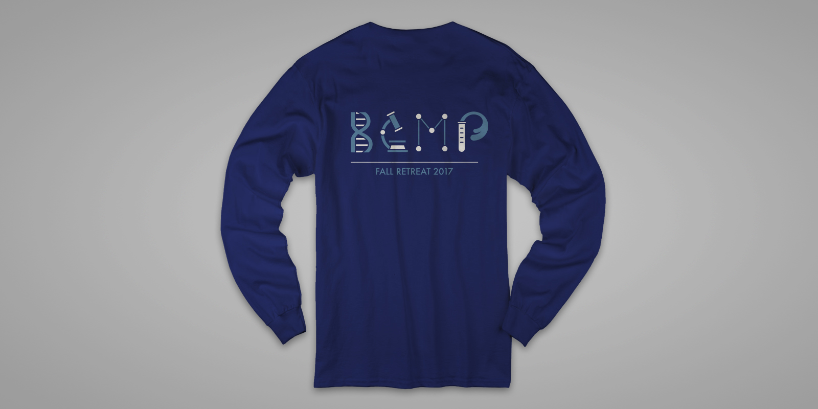
Back
Selected Works

MalakyeUI Design

BackpackerUX Design

JRNY Headphone ConnectUX Design

JRNY App Workout ModalsUX Design
JRNY Color RefinementUX Design

Harvard BCMP ShirtGraphic Design
Haddon CulinaryGraphic Design

Bliss ProvisionsGraphic Design
LeadfeatherGraphic Design

Ion Home KitGraphic Design

Transparent PathProject type
