
JRNY App Workout Modals Redesign
To select a workout in JRNY, users browse through a collection of workout cards and tap one that interests them. This opens a workout modal with more information. They can begin their workout from there or continue browsing. We realized that users were browsing longer than we expected, resulting in less time working out. The users weren't getting enough information. This redesign aimed to fix that issue, and allow for flexibility to add or change elements in the future.
Where did we start?
The existing workout modals gave users a basic set of information, but not enough to confidently select a workout. They would often select one and try it out for a few minutes before choosing a different workout. In addition, without scrolling there was limited vertical space to show all the information available.
Overview
- Long term project for Bowflex's JRNY App, affecting all strength, cardio, and whole body workouts for iOS, Android, and embedded screens.
- In Collaboration With: Hanna Risberg, Trent Edwards, Edyta Blaszczyk
- Tools: Figma, Miro, Confluence
Initial Assessment
The existing modals didn't provide enough valuable information to confidently select a workout. There were a few things we knew we wanted to improve:
- We know time is an important piece of information to our users, so it should be big and easy to find on the modal.
- We tell users the details about the workout type, but we don't explain what they mean. There needs to be more detail here.
- There are two workout profiles displayed, but neither of them give much information. There only needs to be one that shows more detail.
- The top section takes up too much valuable space. Some of the elements can be moved into this area.
- Add more detail to the workout profile to make it more useful for our users.
- Update and unify JRNY's visual design.
Make it more clear to users that program workouts adapt to their fitness level. - Make the modals scrollable to remove the vertical limit for content.
- Use a component-based system for easier design and implementation.
User Testing & Feedback
Our research team tested the modal designs with 7 in-person users and got their feedback on the updated modals compared to the existing ones. Findings were overall positive while still being able to pinpoint areas of improvement needed, as well as the desired priority of information.
Needs to be improved:
- Intensity is a top contributing factor in picking a workout, but you can't really tell from the brickyard what the intensity is.
- Users had to be prompted on the modal that they could scroll - it wasn't obvious.
- Some users stated they weren't quite sure what the brickyard was showing on the card - intensity or elevation.
- Users saw the dots and "Virtual Coach" as well as "Auto-Adjust". However the dots blend into some backgrounds making them slightly more difficult to notice.
- "Untimed" text on Explore the World workouts was somewhat unclear. Assumed it was part of the workout title.
- Titles of workouts don't mean anything to users.
Positive findings:
- The order of information we present on the modal was appropriate to users.
- Users loved the "See more from xyz trainer".
- Users really appreciated the Region/Scenery/Season information.


The charts above outline the priority of information for our users for each workout type. Each workout type had slightly different priorities, but we were able to find some patterns and design in response to those patterns.
What was improved?
We made a combination of changes to the modals to improve the order and amount of information shown to users, to simplify the components to make development and design easier, to improve the readability of the content, and to update the overall look and feel of the modals in the JRNY app.
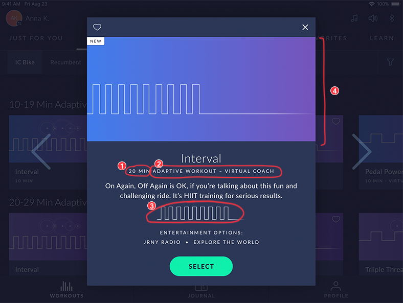
Order & Amount of Information
Based on feedback from users, the information was updated to focus on the most important pieces first, with enough content to make an informed choice about which workout to perform.

Before

After
Scrolling Behavior
We implemented a scrolling behavior that allows us to show full workout images with important interactive elements without losing vertical content space.
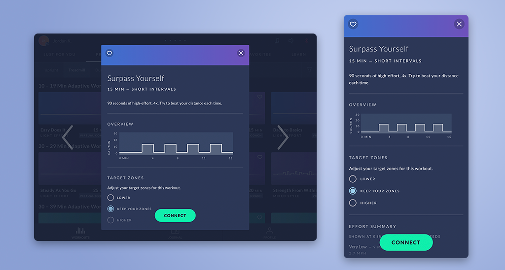
Updated Workout Profile
The original workout profile charts didn't specify the x or y axes, giving very limited information about timing or intensity of each workout. Users had to guess how intense each workout was going to be. The updated modals added more specific information and increased the overall chart size for better readability.

Before
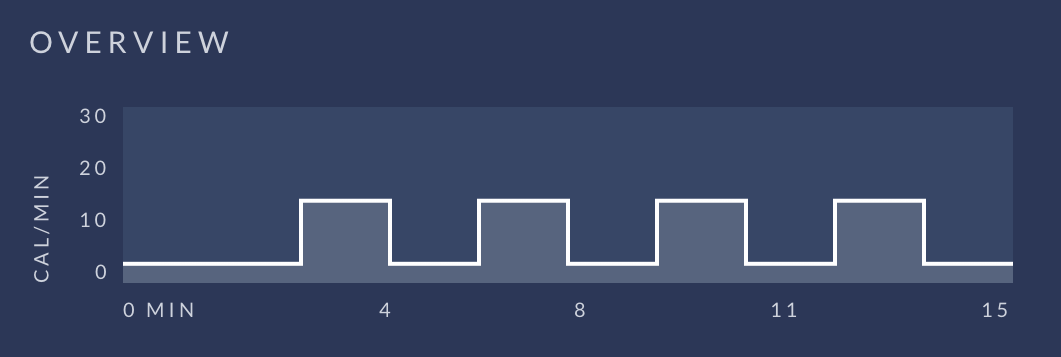
After
Components
While designing the new modals, the team and I organized the information into individual components. This allowed us to turn pieces on and off, making design much faster. It also improved efficiency on the development side.
In addition, we simplified the design to reduce the screen size variations from 7 to just 3: phone, tablet, and embedded screen. Now designers don't need to create seven different variations when handing off new concepts for the JRNY app.

The Final Result
In February 2024, JRNY release 2.19 featured the updated modal designs, capping over a year of work for our design team. The talented developers at BowFlex implemented the changes flawlessly, greatly improving the overall navigation of JRNY.
Overall, the project achieved many goals:
- Provided more information to the user to make confident selections for their workout.
- Illustrated the function and benefits of adaptive workouts.
- Removed the vertical limitation of information in our modals.
- Allowed easy changes or addition of information in the modals.
- Simplified the design and development process by limiting to 3 total sizes: embedded, tablet, and phone.
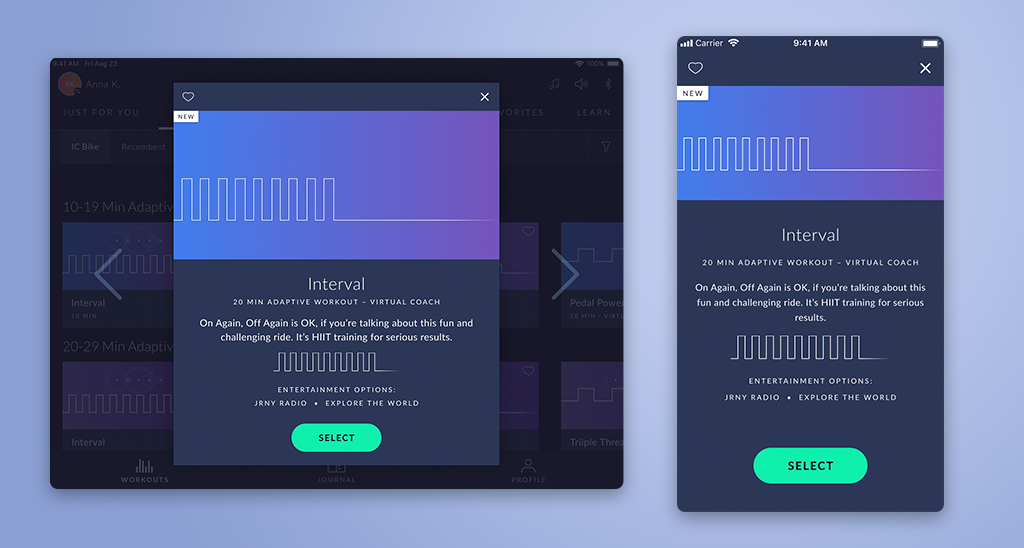
Below are the tablet and phone versions of the new workout modals.
Selected Works

MalakyeUI Design

BackpackerUX Design
JRNY Headphone ConnectUX Design
JRNY App Workout ModalsUX Design
JRNY Color RefinementUX Design

Harvard BCMP ShirtGraphic Design

Haddon CulinaryGraphic Design

Bliss ProvisionsGraphic Design

LeadfeatherGraphic Design
Ion Home KitGraphic Design

Transparent PathProject type

jkulhawik@gmail.com