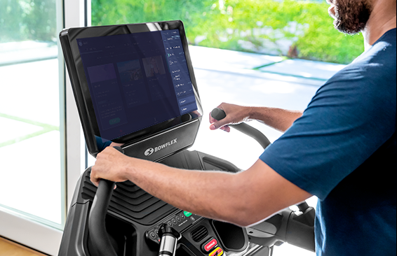
JRNY Color Refinement
The color system used in the JRNY app had become inconsistent and disorganized, making it diffifult for users of the app. Without a set of color usage rules in the design system, the app lacked cohesion from one screen to the next. The goal of this project was to identify the issues, organize the color patterns, and set a system in place for future design and development.
Two month project affecting the entire JRNY app.
Collaboration with Edyta Blaszczyk, Digital Production Designer.
Tools: Figma, Miro, Confluence
Identifying Issues
- Inconsistent colors of text creates confusion for the user
- What is and isn't tappable?
- Why are some text and icons white, while some are beige?
- Does red signify an error or highlight a feature?
- Accessibility issues make parts of the app difficult to use.
- Several elements are unreadable due to lack of contrast
Goals
- Clearly differentiate between copy and tappable links.
- Increase perceived value.
- Visually simplify JRNY (lessen the mental load on users)
- Strengthen the JRNY brand.
- Improve navigation for users to quickly and confidently select a workout.
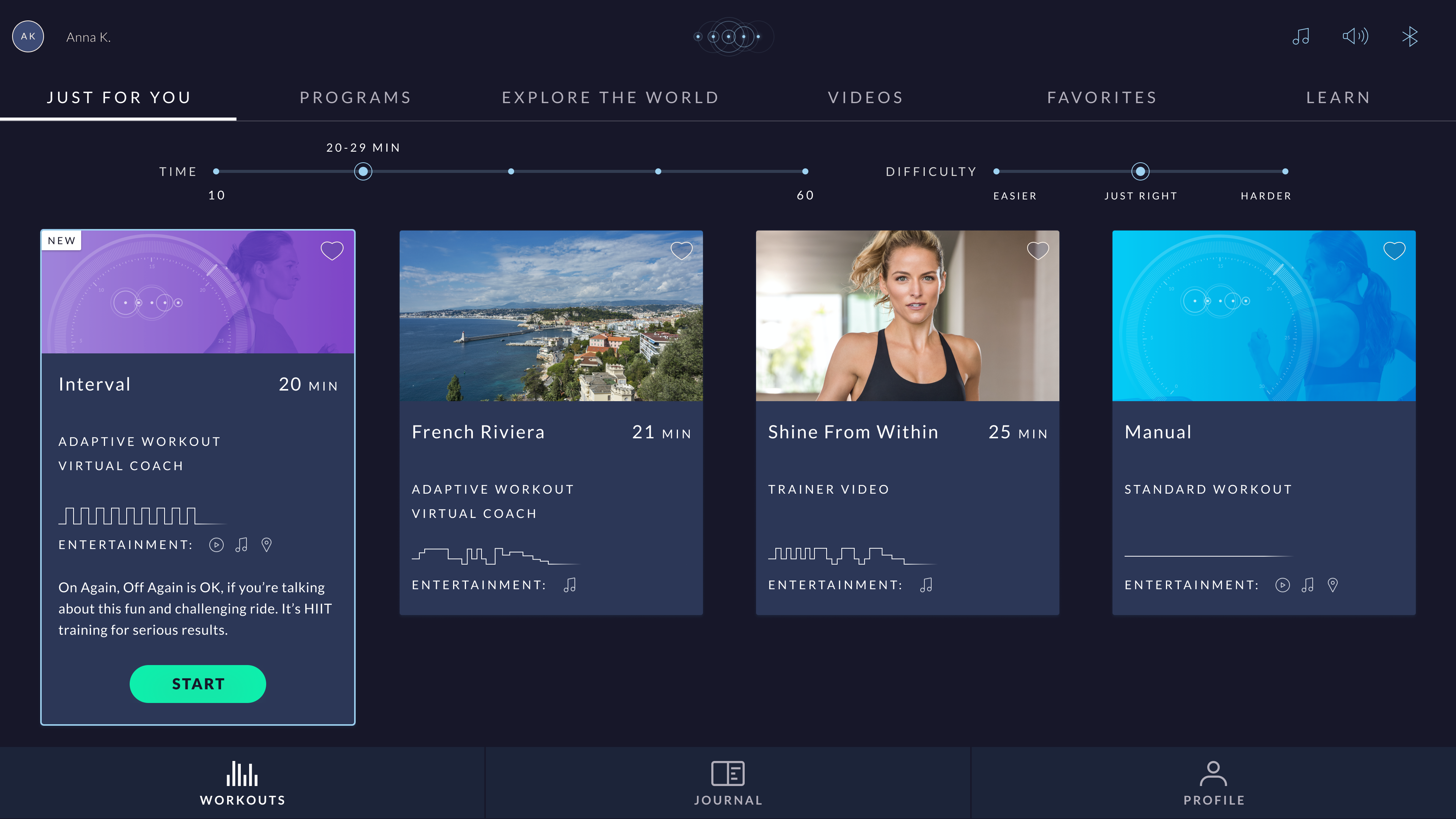
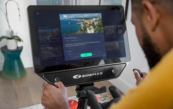
Initial Assessment
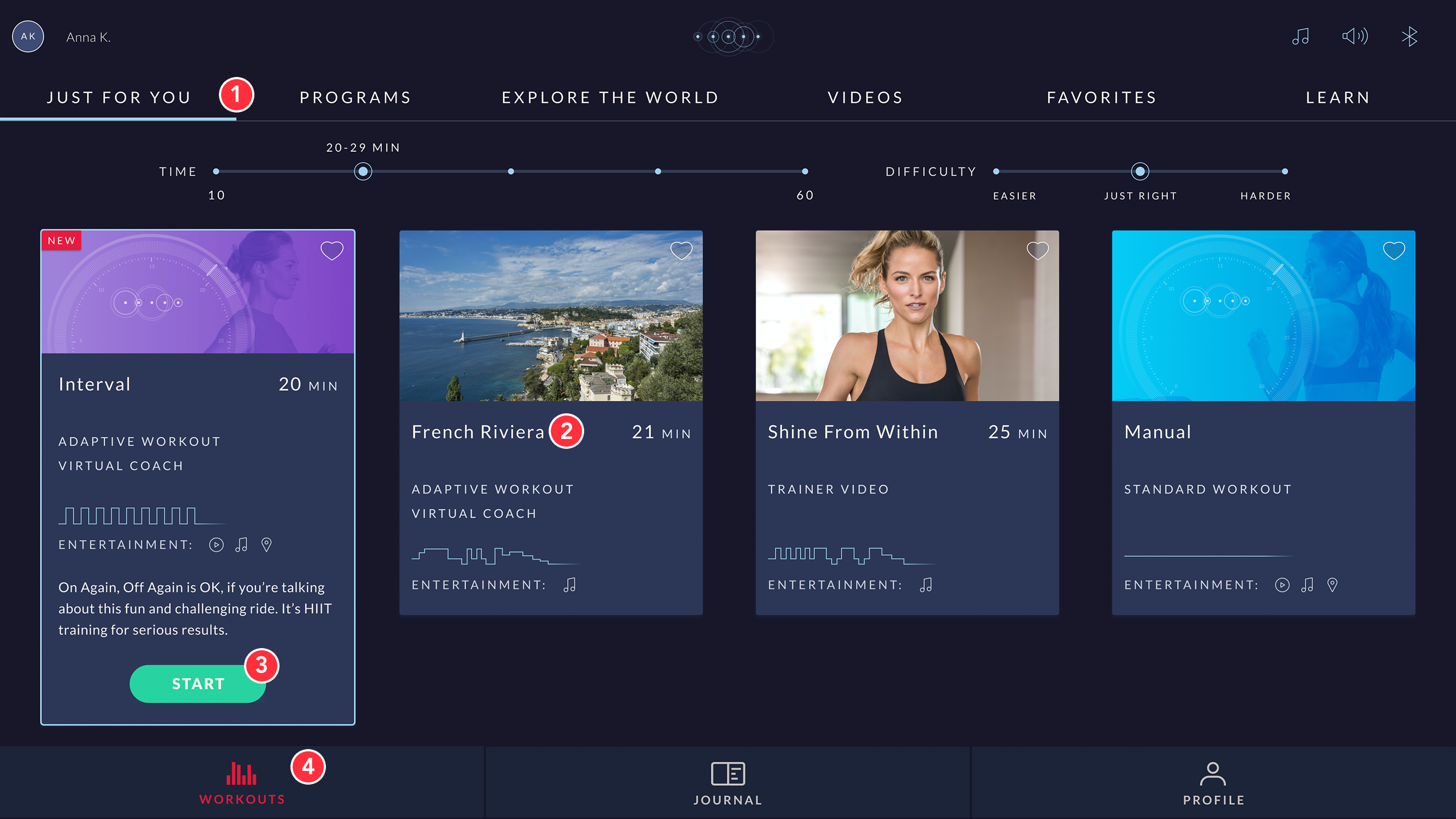
We reviewed the colors in the JRNY app and where they were used. Some – like the text on the primary buttons – immediately stood out as issues, while others took a while to discover.
- Light blue was designated as an action color, and needed to be used consistently.
- Lack of consistency for the main text color. Sometimes it was pure white, and sometimes off-white.
- Not enough contrast between the text and background of the primary buttons.
- Using red for the selected tab on the main navigation bar seemed like an error.
- (Not pictured) Some colors were not used in the app, and needed to be removed.
Improvements
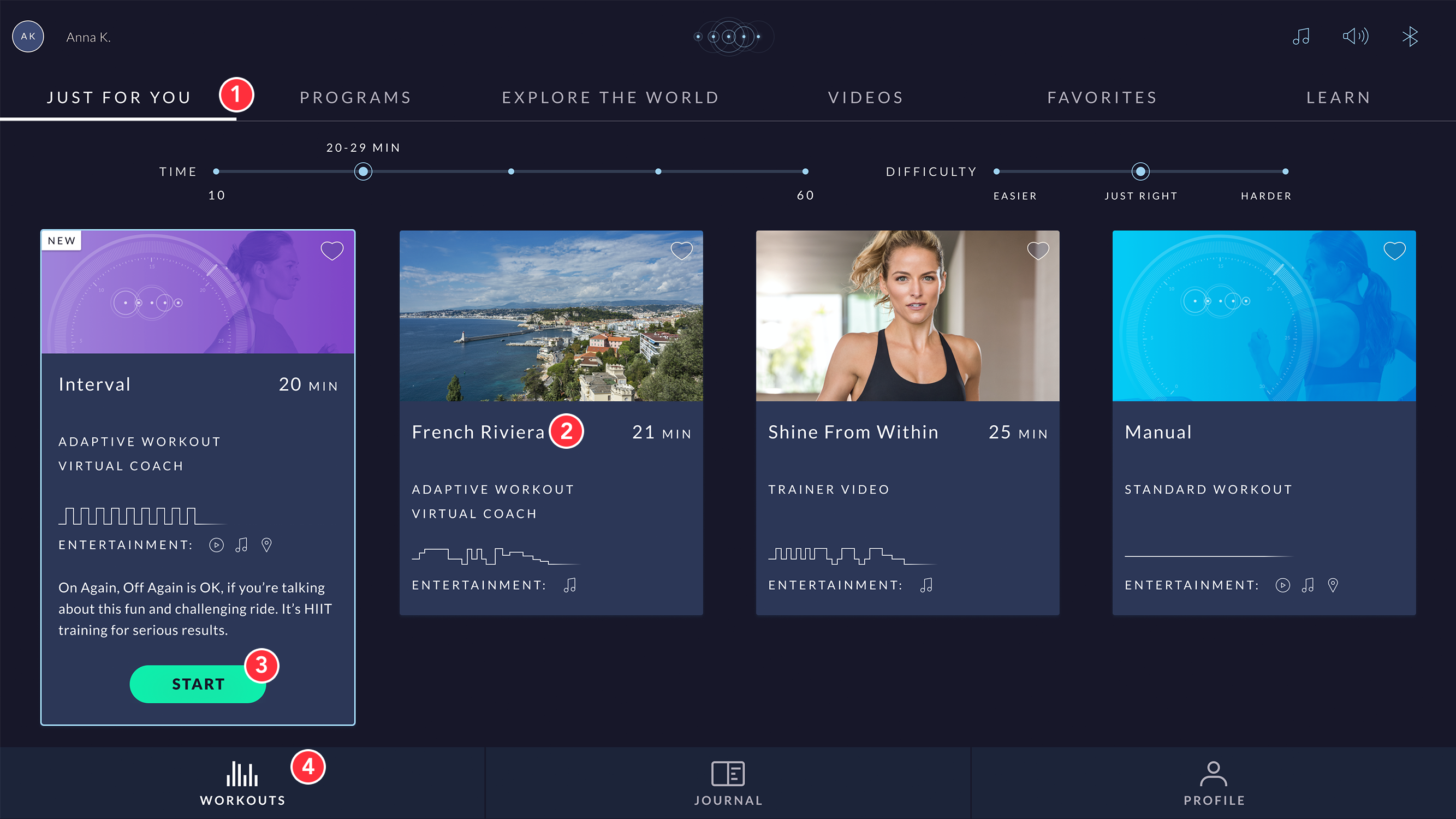
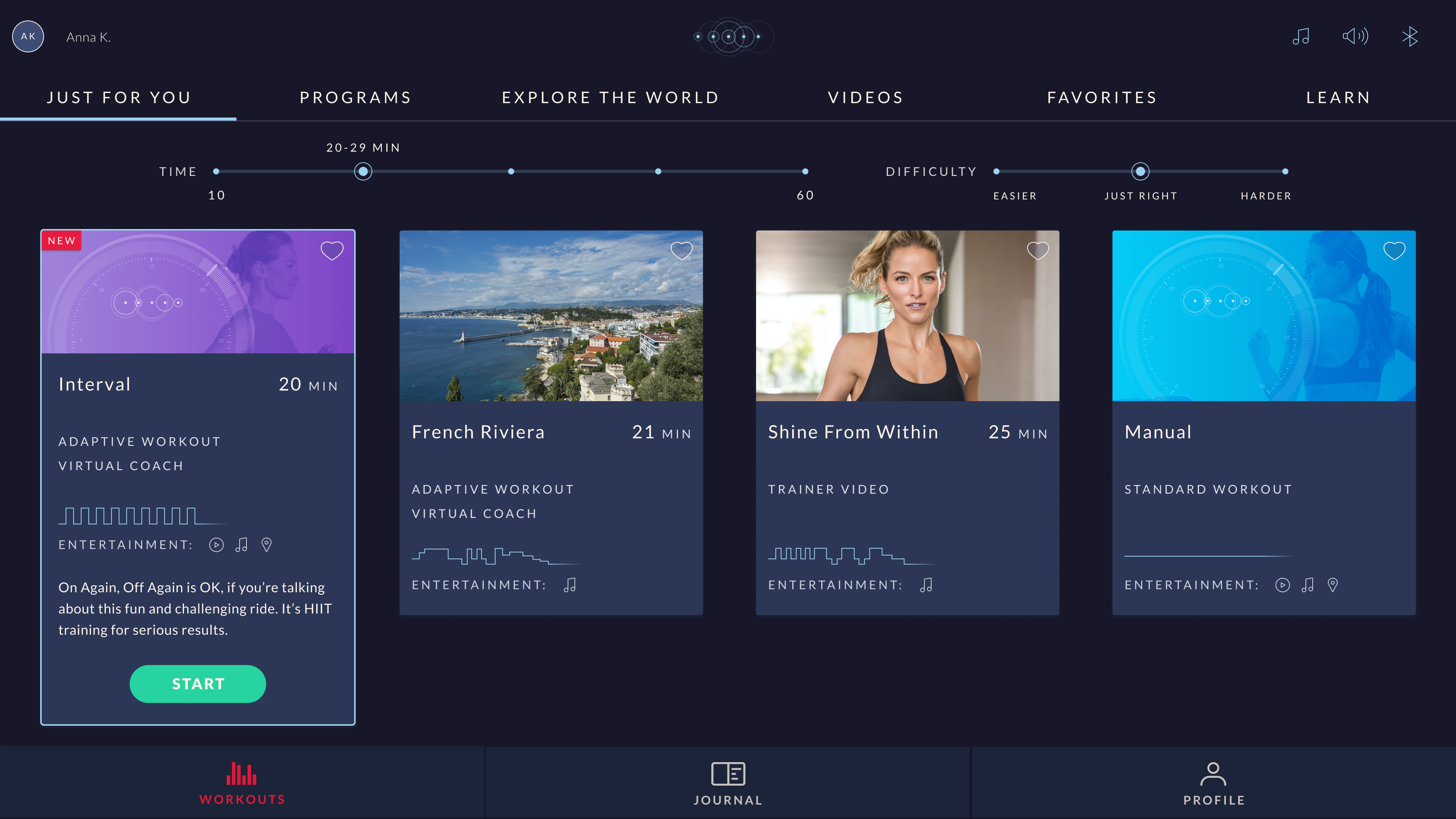
We decided on a simpler color scheme to quiet the overall experience and highlight the most important elements; the workouts.
- White is now used to highlight the selected tab, while light blue is reserved for active elements.
- The main text color is now white to maximize the contrast and simplify the experience.
- The primary button now has more contrast (11.72 to 1) and passes WCAG standards.
- The main navigation bar uses white as its highlight color. Red is now reserved for errors only.
Before & After
Below shows the same screen before and after the color update. Although this affects the entire JRNY app, focusing on one screen allows us to easily compare the differences. Notice where your eye naturally goes, and which elements call out for attention rather than highlighting an active state.
Wrap-Up & Execution
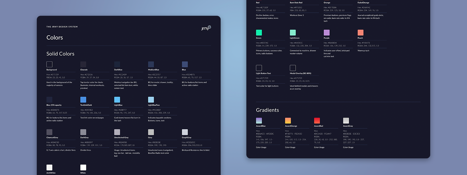
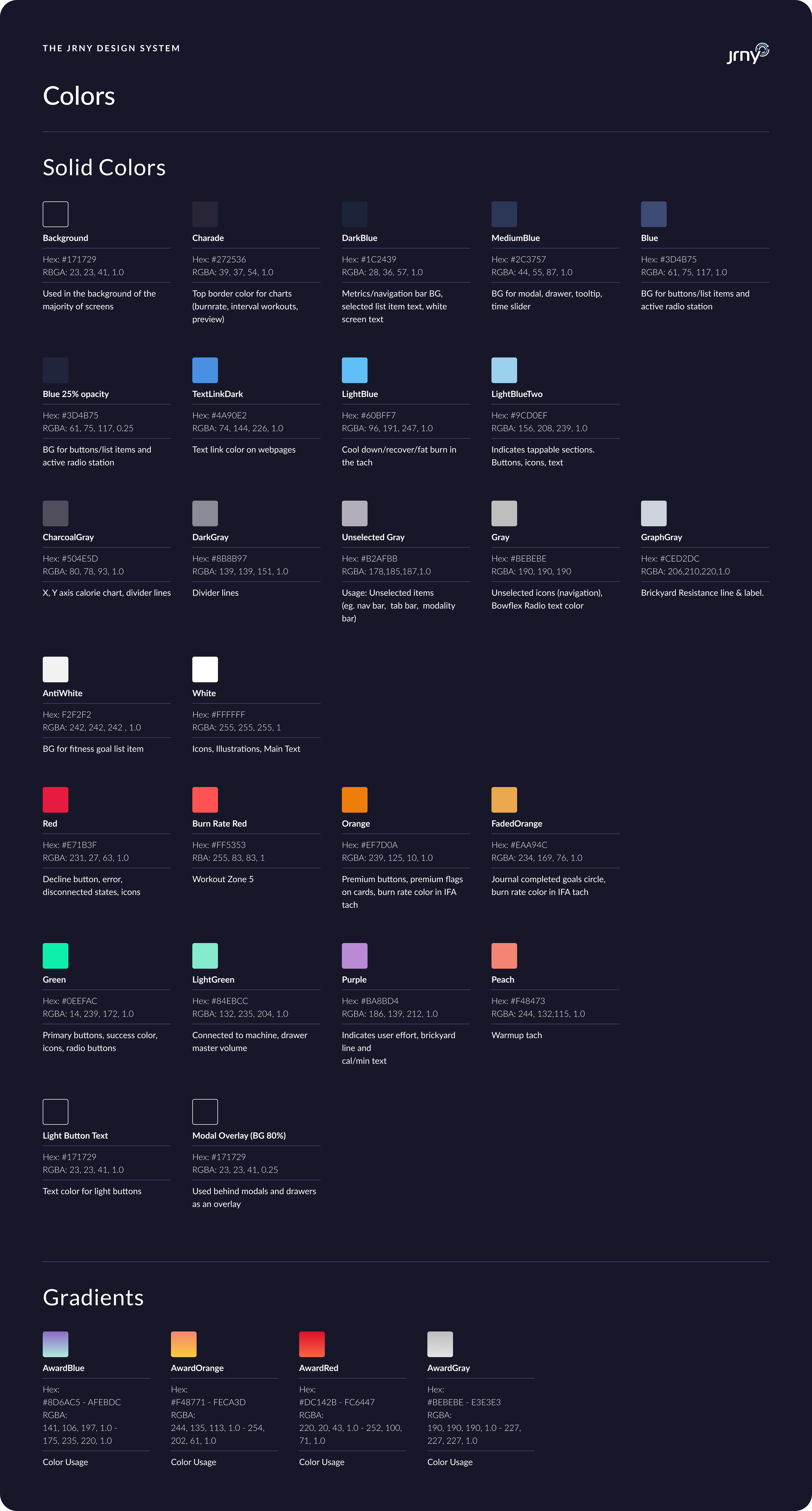
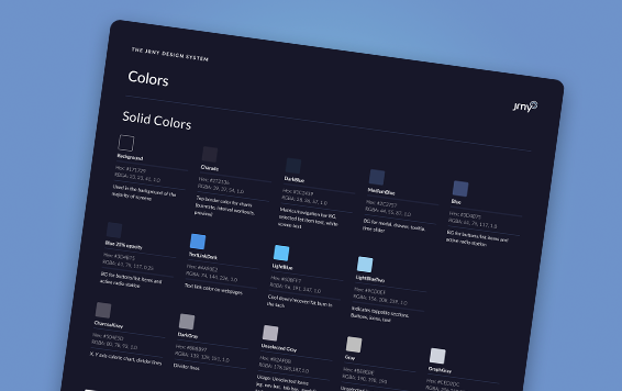
Through this project, Edyta and I were able to simplify the use of colors throughout the JRNY app, and set specific rules where those colors should be used. We also set up a color library in Figma to make it easier for designers to use (example shown here).
This improved readability in the app, and made it easier for our users to navigate. Simplifying the colors also allowed us to highlight the workout content rather than the navigation, and more aesthetically pleasing in general.
We worked with developers and project managers to implement these updates one step at a time, focusing on the most important aspects first. The updated colors are available in the current version of the JRNY app, available in the App Store or Google Play Store.
Selected Works
MalakyeUI Design
BackpackerUX Design
JRNY Headphone ConnectUX Design
JRNY App Workout ModalsUX Design
JRNY Color RefinementUX Design
Harvard BCMP ShirtGraphic Design

Haddon CulinaryGraphic Design
Bliss ProvisionsGraphic Design

LeadfeatherGraphic Design

Ion Home KitGraphic Design

Transparent PathProject type

jkulhawik@gmail.com