Tracking the Food Supply Chain
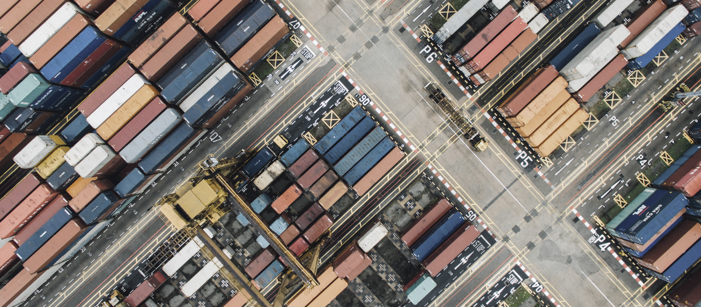
Transparent Path is a Seattle-based company that focuses on tracking shipments in the food supply chain by combining IoT sensors with Blockchain technology. Their product can track the location, temperature, and humidity of shipments all over the globe. I worked on a team of three alongside a project manager and a researcher to build a shipments dashboard focused on helping chocolatiers track their shipments and be notified of issues such as melting or delays.
Overview
Client Project with Transparent Path
Duration: 3 Weeks
Team
Jordan Kulhawik
Visual Designer
Harrison McNeil
Project Manager
& Information Architect
John Strohschein
UX Research Lead
Steps
- Industry Research
- User Research
- Defining the Solution
- Initial Digital Product
- Iterations
- Testing
- Final Product
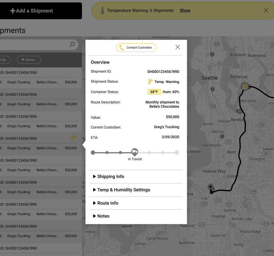
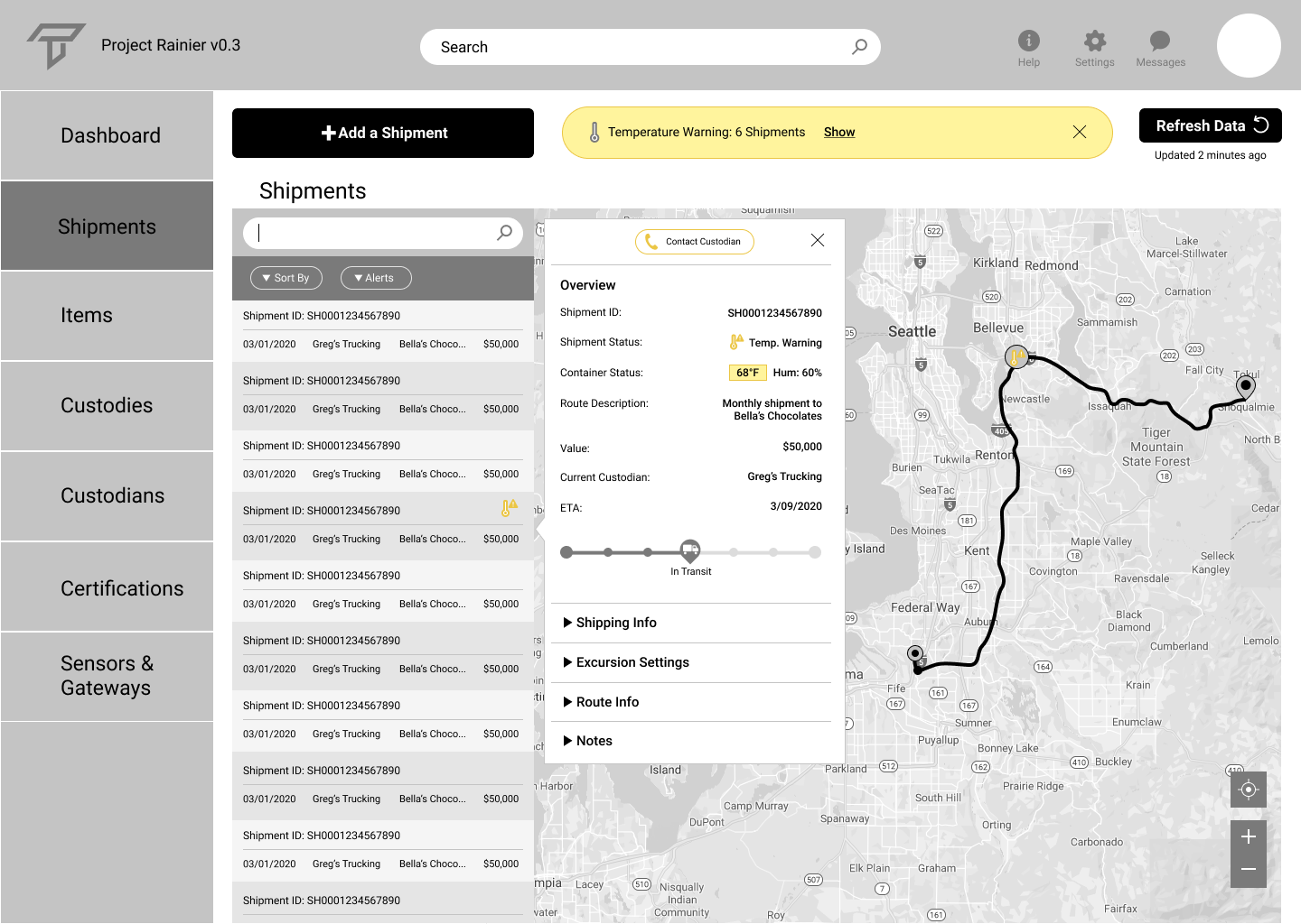
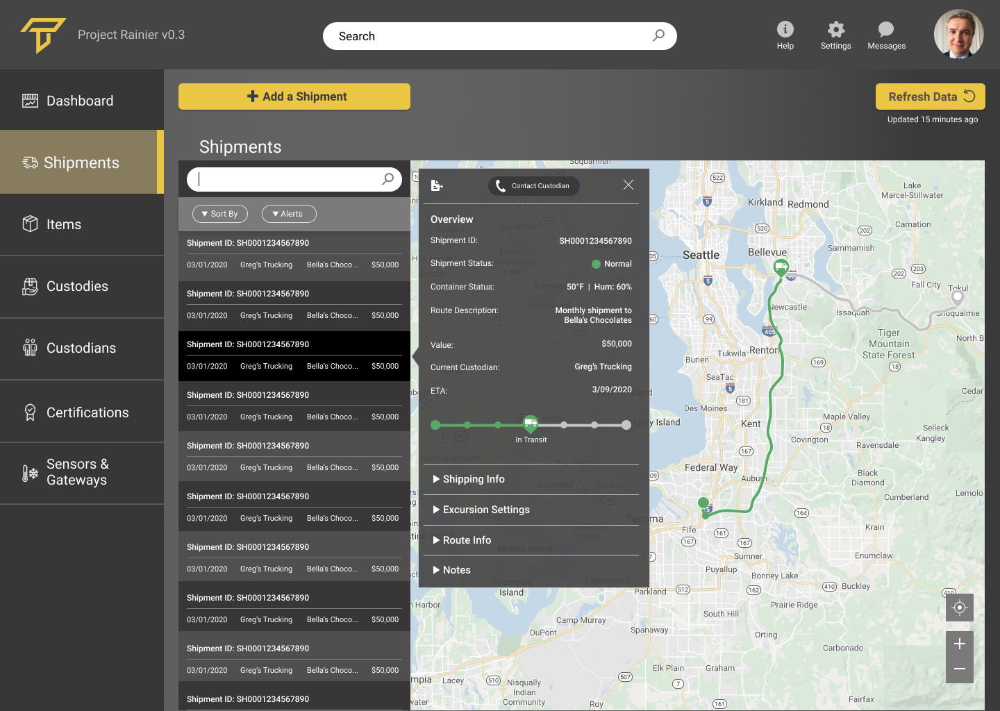
Managing Chocolate Shipments
An Example From the Shipments Dashboard Solution
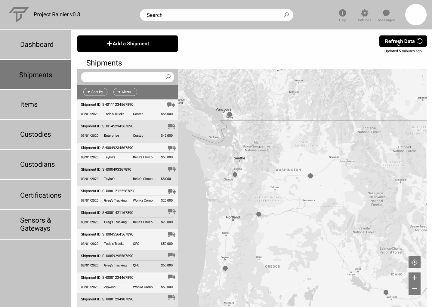
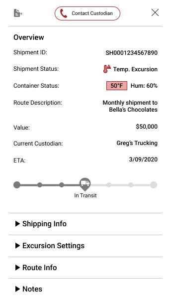
Here's an example of one of the work flows for our solution. One of the user's shipments shows a temperature excursion notification. This follows the steps taken to correct an error in the temperature and humidity settings. The following sections show how my team and I came up with this solution.
From the Beans to the Shelves
Research on the Chocolate Supply Chain
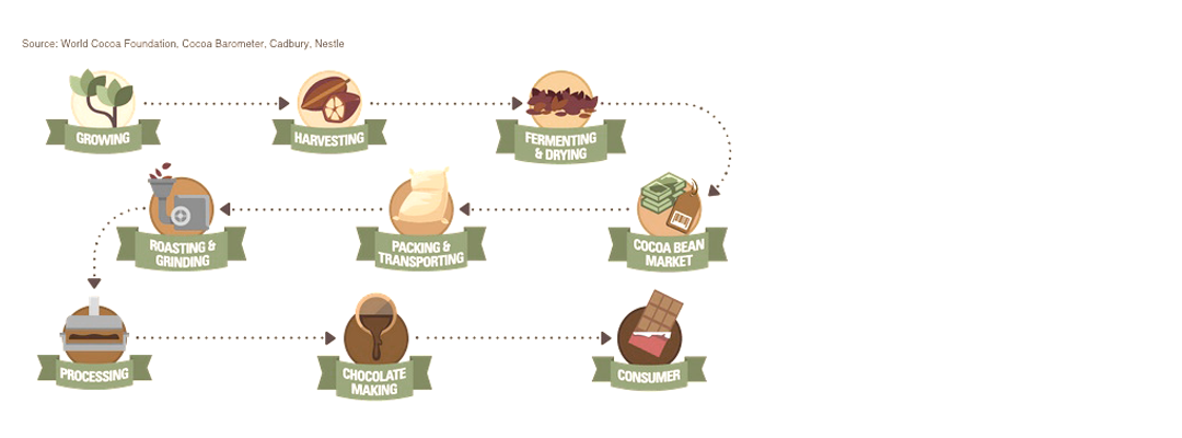
Our team had very little knowledge and experience of the chocolate supply chain, so the first few days were spent doing research to understand everything that goes into making and distributing chocolate. Below is a list of the steps involved from the farm to the retail stores. While our solution will focus on the last four steps (from manufacturing the chocolate to retail stores), it is important to understand the whole process.
- Cultivation
- Harvest
- Fermentation & Drying
- Selling to Market
- Shipping to Processor
- Processing the Raw Cocoa
- Manufacturing the Chocolate
- Packaging
- Distribution
- Retail
The Chocolatier
Demographic & User Research
With a combination of research and remote interviews with chocolatiers, we were able to get an idea of what Chocolatiers value and need. Our teammate Harris was able to build a persona based on interviews with people in the chocolate industry and chocolate supply chain. This, along with industry research and insight from the Transparent Path team is how the decisions for the design began.
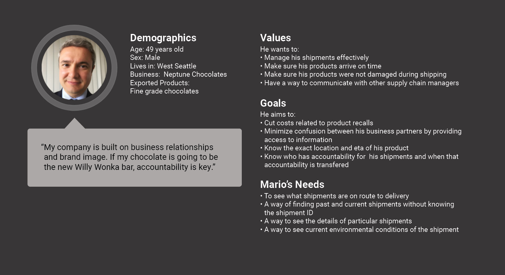
Industry Relationships Are Key
The chocolate industry reaches almost every part of the world, but is still a relatively close-knit community. Because of this, the relationships between different companies is very important, and trade and communication is a key part of those relationships.
Accountability Affects
My Reputation
A brand is only as good as it's reputation, and being accountable for providing high-quality products on time positively improves a brand's reputation.
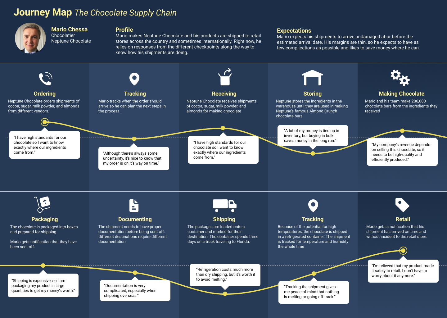
Here is a visualization of the journey of Mario, our chocolatier persona from when he receives ingredients, to manufacturing, to when his product arrives in retail stores.
The Initial Solution
What does the user want to see?
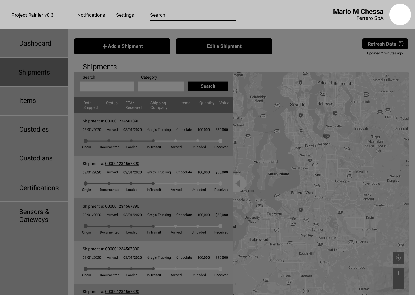
As the visual designer, I led the design for wireframes to be used for user testing. We focused on medium fidelity wireframes with simple graphics and very minimal color. This allowed us to be able to test certain features without giving the impression of full functionality.
The biggest challenge was to be able to show all the necessary data in a limited amount of space. A shipments dashboard like this involves a lot of data, including location, ETA, type of product being shipped, the lot number of the shipment, who is currently handling the shipment, and if there are any issues with temperature, time, or humidity. Usually there are multiple shipments going all over the country, sometimes internationally. To tackle this challenge, we had to prioritize what data is most important, where to show it, and how to display it in a readable and scannable way.
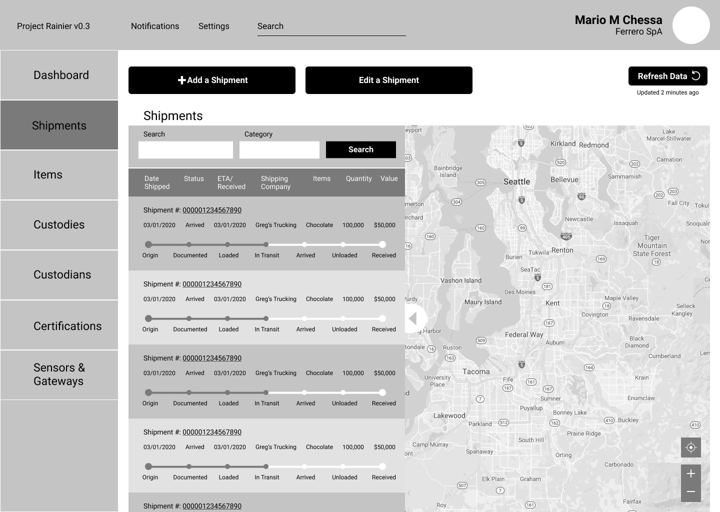
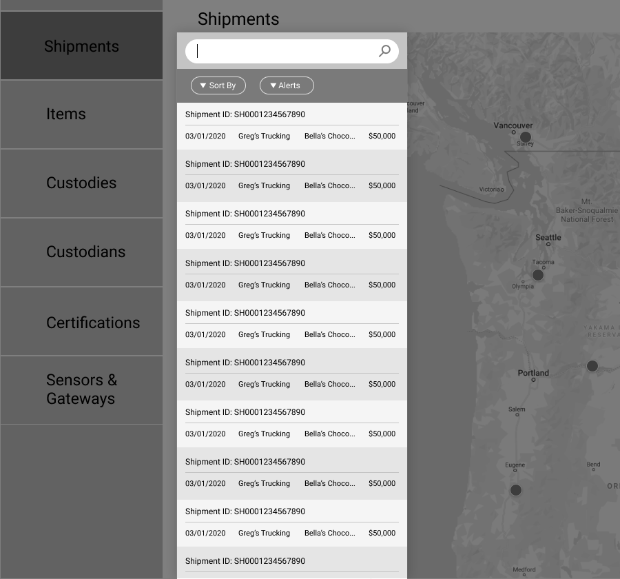
This is the initial wireframe for the shipments list page. After discussions with the team members about the user interviews and industry research, we were able to create a visual representation of what the basic layout should include,
What can be improved?
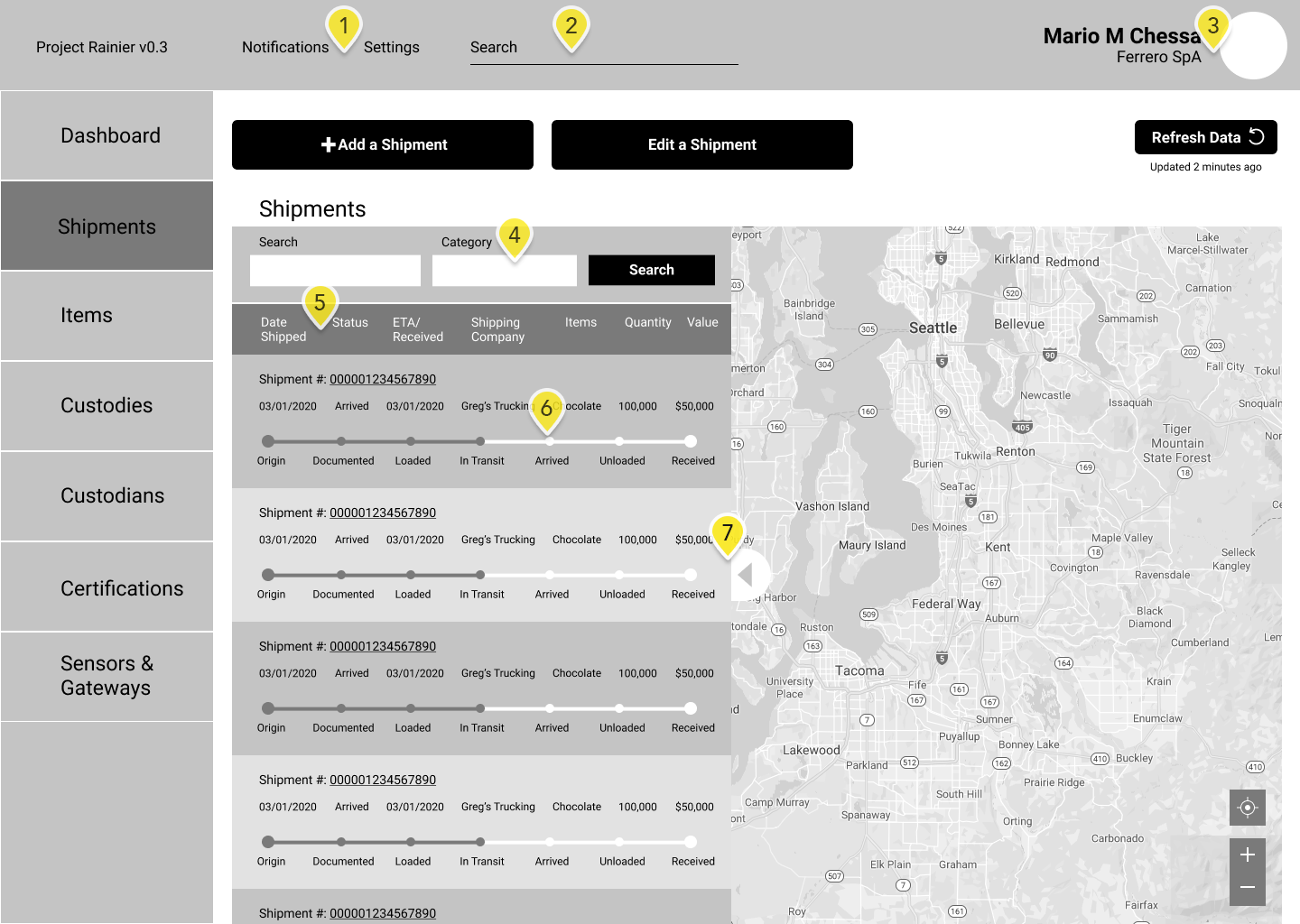
After a round of testing our prototype and reviewing it with Transparent Path, it was clear there were a few issues that needed to be fixed.
- The notifications and settings were not where our users expected them to be.
- The search field for the dashboard does not stand out and is easily overlooked.
- The user's name and title do not need to be visible here. The user knows this information, and the photo would indicate who is currently logged in.
- Our testers had a hard time understanding how the two search bars in the shipment panel work, and it would be a difficult challenge for the developers. These should be combined into one search bar with filtering options.
- The list headers make it look very cluttered, especially when they contain two lines of text. This needs to be simplified.
- The progress bar gets in the way of scanning the columns for information. This needs to be moved to the next panel of data.
- The column is too wide and obscures a large portion of the map. It needs to be made narrower, and the details can be moved to the next panel of data.
I describe the steps I took to improve these issues with the second iteration of the dashboard below.
What Was Changed?
Second Iteration
As with any design project, it’s an iterative process. We talked with other UX design experts about some of the issues that users might have with the design, and got valuable feedback from user experience experts to improve upon the original wireframes. Below are some of the changes that were made.
Shipment List
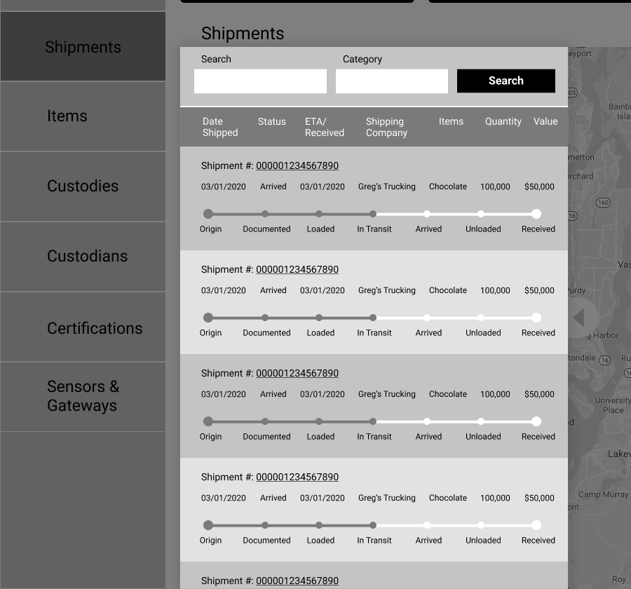
Before
Too Wide: Half the usable space was taken up by the shipments list.
Confusing Search: Users would get confused by the two search boxes, didn't know what "category" meant.
Difficult to Scan List: The data was in columns, but was interrupted by items like the title and progress bar, making it difficult to visually scan the information.
Sort Feature: Confusing and not apparent sort bar for the shipments list.
After
Minimize screen space: Reduced the width by 1/3. Prioritized information, moved some of that info to details page.
Improved search bar: Simplified Search to one field, replaced button with familiar icon.
Moved progress bar: The progress bar was moved to the details panel.
Sort Feature: Sort bar was changed to something more familiar to users with button shapes as a signifier, Sortable filters for the left button and an alerts toggle for the right.
Top Nav Bar
Before
Search Bar Too Subtle: Users are likely to pass over it or assume it doesn't apply to the whole dashboard.
Notifications and Settings Placement: They are not on the right side where users would expect them
No Logo: Doesn't enforce the company's identity, users won't know what "Project Rainier" is without context.
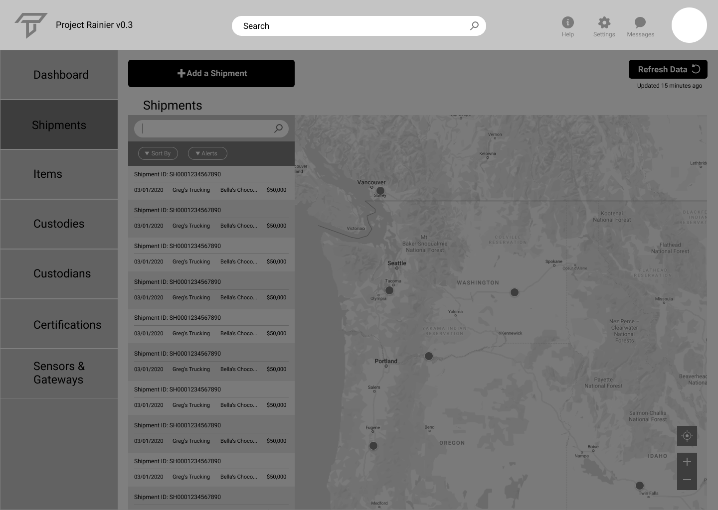
After
Emphasized the Search bar: Some users will need to search for specific items, especially if they are new to the dashboard.
Removed Name and Title from Profile: Users like Mario know who they are, so a simple photo is enough of an indication of who is currently logged in.
Added Transparent Path Logo: Improves brand awareness and acts as a home button
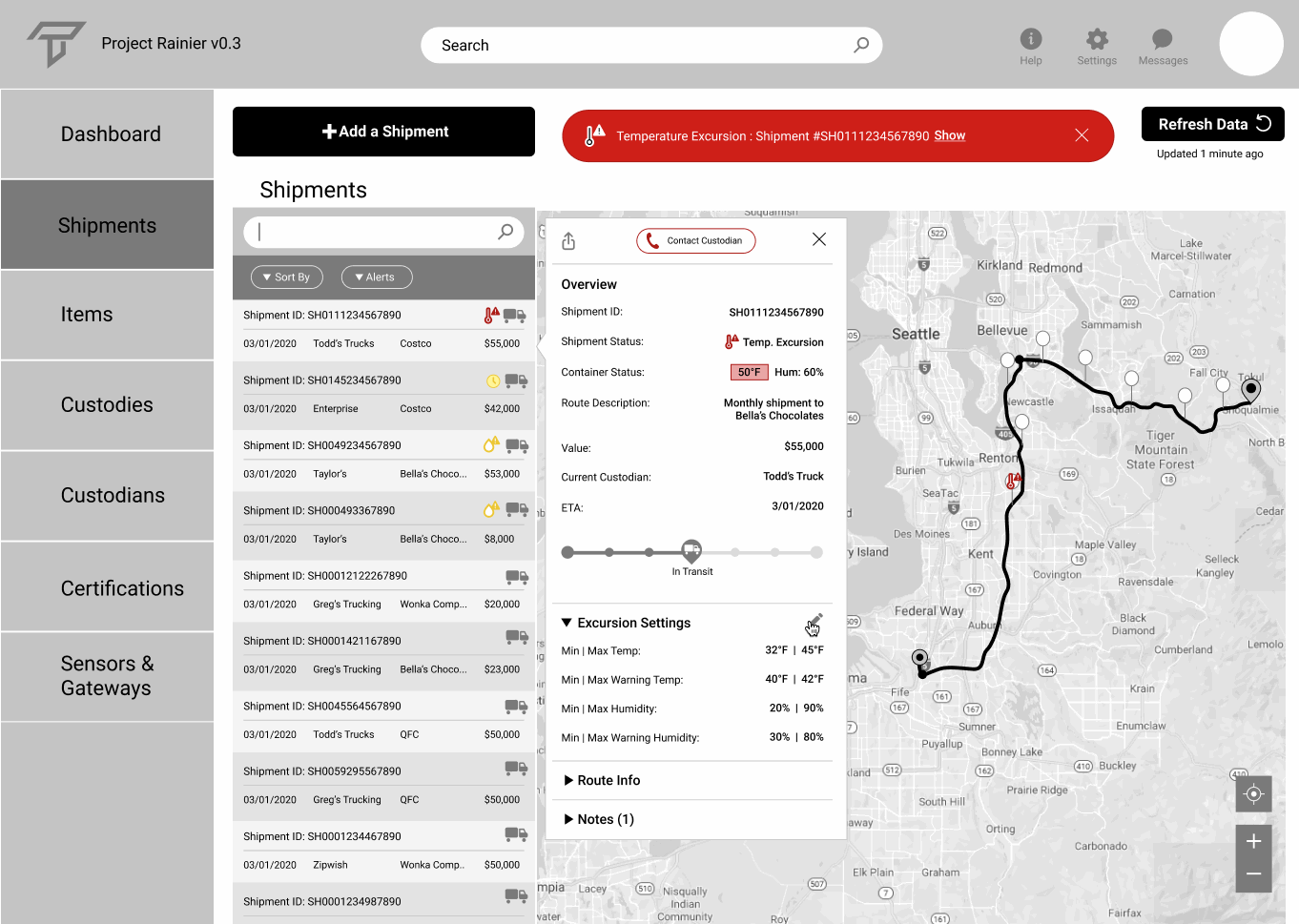
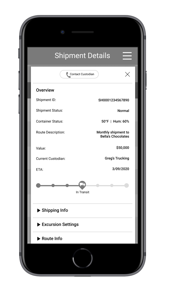
Shipment Details
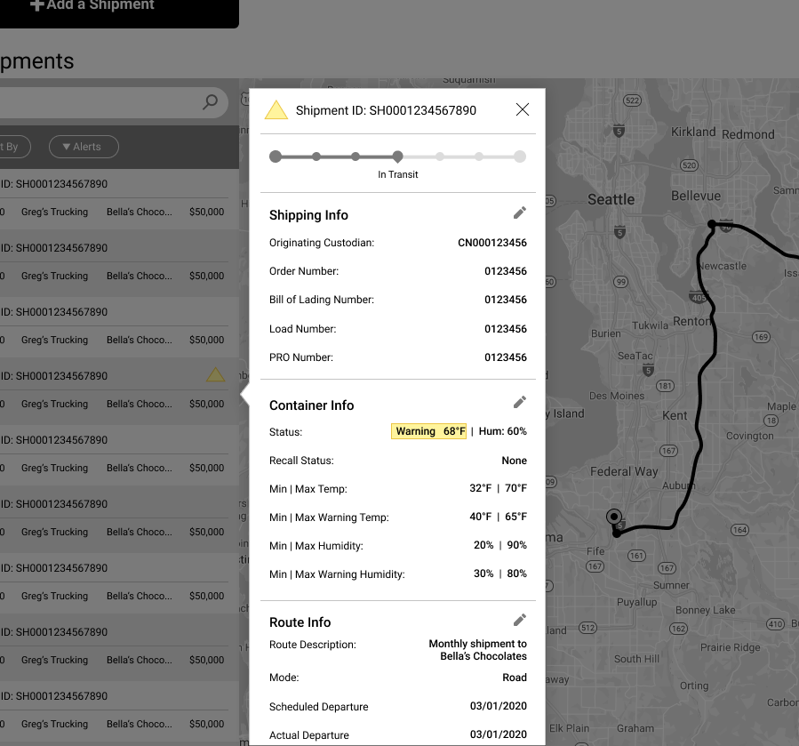
Before
Categories Need Improvement: Most important info should be at the top, no need to search for it.
Too Tall: The details take up too much vertical space, Collapsible rows could help.
Limited Actionable Items: What does Mario do when there's an issue? Who can he contact?
After
Better Categorized Info: Mario can easily see the pertinent details about his shipment right at the top.
Expandable Sections: Allows users to dig deeper into sections if necessary while minimizing space.
Improved Alerts: Iconography added to address the type and severity of an issue.
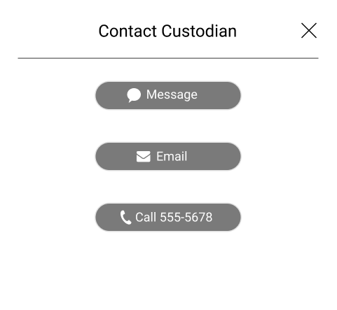
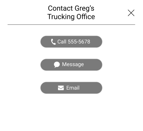
Contact Custodian: Added the ability to contact the person or company currently handling the shipment.
Fixing Frustrations
Remote Testing
Since the quarantine prevented any in-person testing, all of our tests were done remotely. Our teammate John was able to perform three 40-minute usability tests which asked the users to do the following:
- Search what was sent to Wonka Company by Todd’s Truck in the past two months and identify which shipment was a recall that was already resolved.
- Find out the reasoning why the recall happened.
- Remove filters and refresh the page
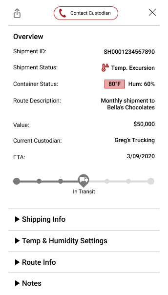
- Find out the reasoning for the red excursion. Edit the temperature limit
- Find out the reasoning for the yellow delayed shipment and identify where the truck currently is
- Contact the custodian for more details.
Analysis & Takeaways
The biggest pain points for our users were:
- Changes in the Shipment Details panel weren't clearly marked as Saved.
- When contacting the custodian, it wasn't clear who they were calling.
- The excursion settings label and forms were confusing at first glance. Difficult to comprehend.
- The Export Data icon in Shipment Details wasn't clear. Too small and vague.
Contact Popup
Our testers commented that when they clicked on the "Contact Custodian" button, they weren't sure who they were getting in touch with. The way they approach the trucking office might be different than talking with the actual driver. To fix this, we changed the title to include the specific point of contact.
Save Successful Confirmation
When our testers followed the third item on our test list, they were not sure if the changes made in the Shipment Details section were actually saved. Many commented that some kind of confirmation is desired. In response, we added the green change confirmation bubble at the top of the dashboard.
Terminology Changes
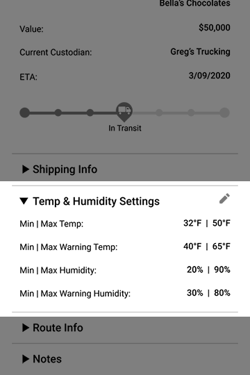
Although the term "Excursion Settings" was fairly well known within Transparent Path, some of our testers were confused by this terminology. To solve this, we made it more specific, renaming it to "Temp & Humidity Settings".
Adjusting the Settings
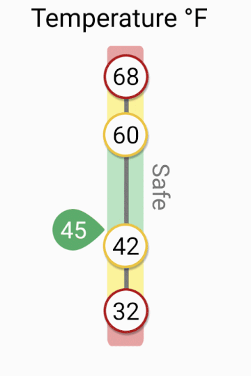
Originally the temperature and humidity settings for shipments were controlled by text boxes for max temperature, warning high temperature warning low temperature, and minimum temperature, Although our testers understood it, it took a while to really grasp what we were asking for. I created this thermometer-based slider to create a better mental model for our users and allow for another method of setting values.It will take up a little more screen space, but it's worth it to make things simpler for the user.
Final Product
What was improved?
Usability testing, design discussions, and walkthroughs of the prototype with the team led to big improvements to the dashboard. Compared to the first iteration, the shipments are easier to scan through, the information is more organized, and the visual elements allow users to better assess issues and manage their products on their way to stores or wherever the final destinations might be.
Setting up Shipments
The Need
In order for people to start using the product, we needed to create a way for them to set up a shipment. Our goal was to make the setup as easy as possible to complete while collecting all the necessary information. The challenge was first to understand what information Transparent Path needs to track the shipment, and to ask for that info in an easy to follow way.
The Steps
We split the details into 5 different steps; Shipment Details, Custodians, Items, Sensors & Gateways, and Shipment Overview. The progress bar at the top shows where the user is in the process, with the ability to cancel or go back at any time. We realize that errors happen, so the Shipment Overview is there for people to check the details before adding a shipment to the system.
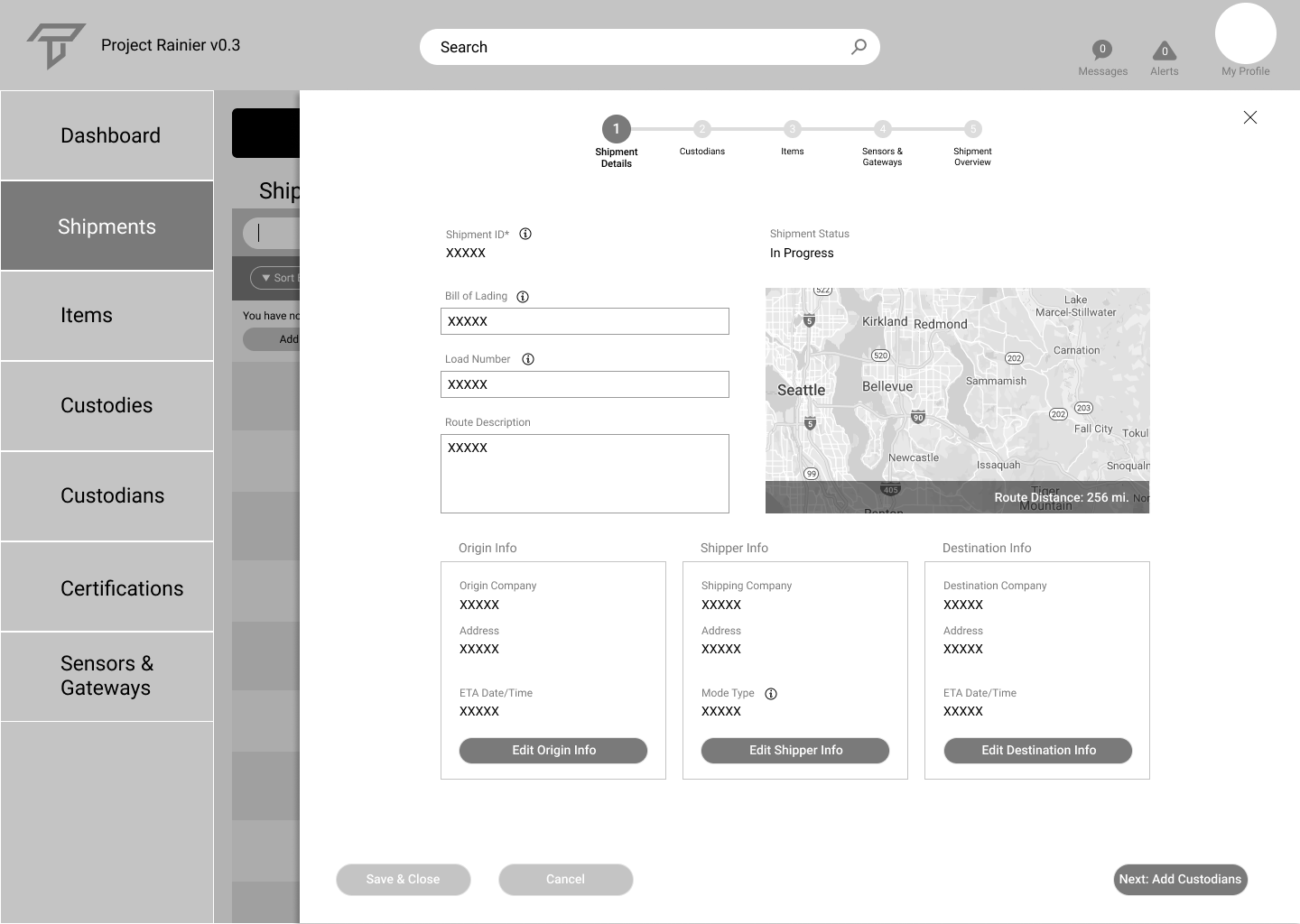
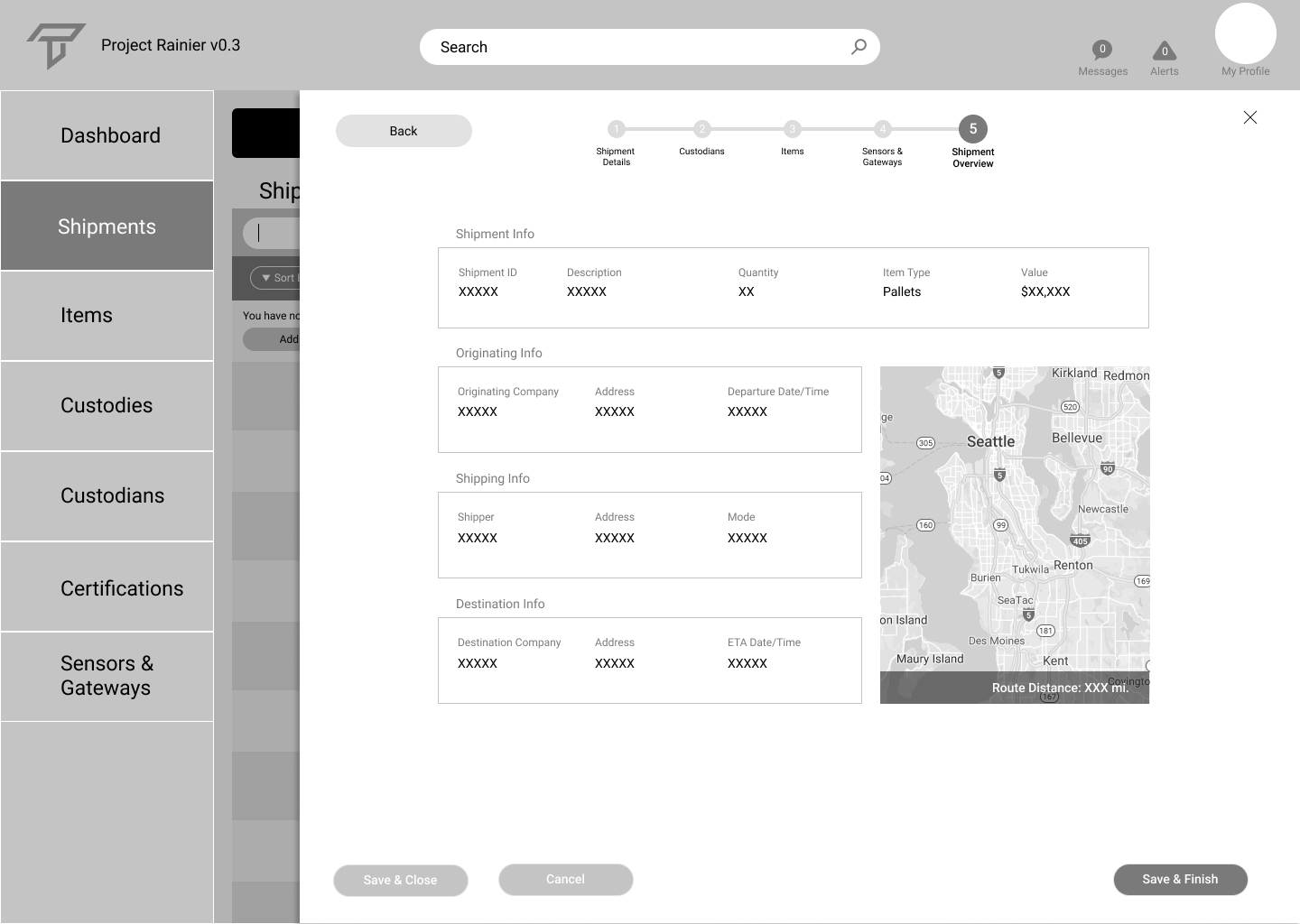
How it Works
The form was split into different steps, with overlays for each step, in order not to overwhelm the users and give them a reference point to where they are in the process. Below is an example of how it works.
What are the Next Steps?
More User Testing
Since this dashboard is such a complex product with many moving parts, it is important to perform 5-8 more usability tests to make sure everything works how it should and to prevent errors. We want to make this tool as easy as possible to use, and make it intuitive to allow people to use it without complicated onboarding process,
High Fidelity Mockups
While we created the shipments page, additional pages of the dashboard are still required for a minimum viable product, including Items, Custodies, and any of the other pages in the left navigation.
While high fidelity mockups are not exactly necessary for prototyping, we will want high fidelity mockups of any unique screens to show how Transparent Path’s branding will look on our solution, to test colors for contrast and readability, and to give an idea of what the finished product would look like.
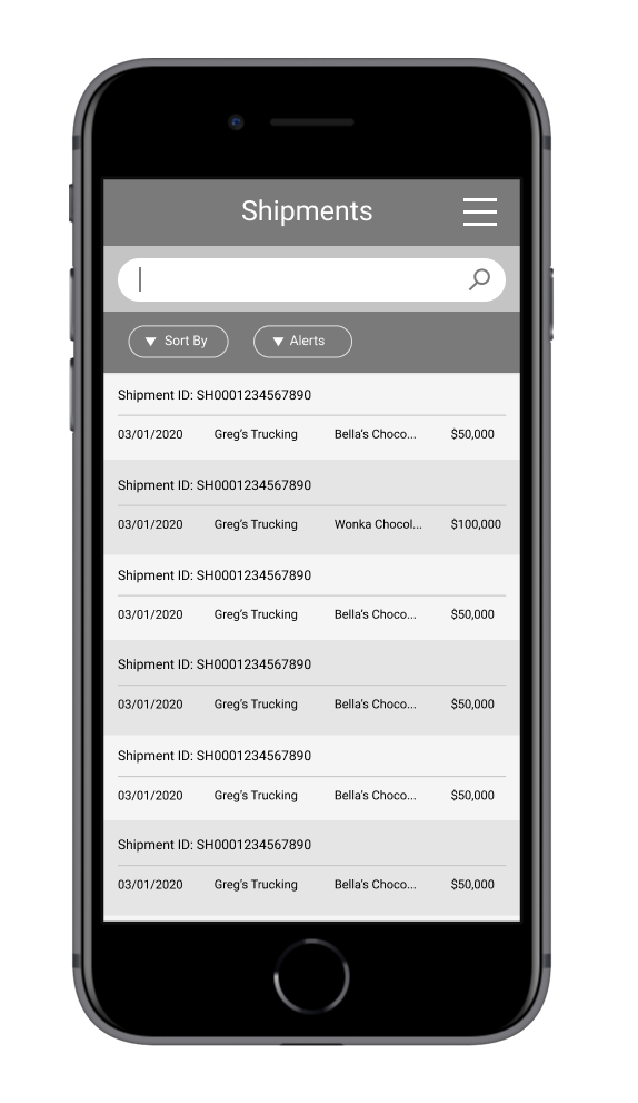
Mobile Wireframes
We had responsiveness in mind for our solution, making the transition to mobile less of a challenge. Each panel on the desktop dashboard corresponds to one screen as seen below with the Shipments List and Details. This will allow users to access the product from anywhere, see notifications and call and message right from their device.
Mobile does have a limited screen size, so fitting all the data and making it readable will be challenging, as will accounting for different interactions and methods of data entry.
Selected Works

MalakyeUI Design
BackpackerUX Design
JRNY Headphone ConnectUX Design
JRNY App Workout ModalsUX Design
JRNY Color RefinementUX Design

Harvard BCMP ShirtGraphic Design

Haddon CulinaryGraphic Design
Bliss ProvisionsGraphic Design
LeadfeatherGraphic Design
Ion Home KitGraphic Design
Transparent PathProject type

jkulhawik@gmail.com